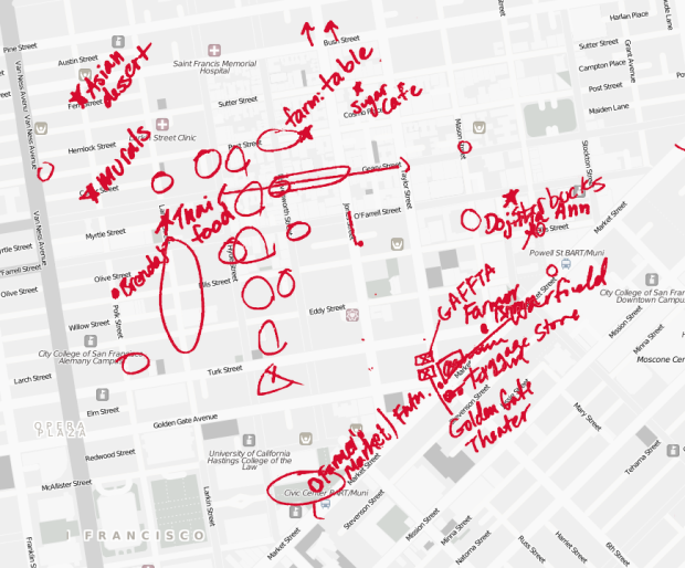
TenderMaps brings an informal approach to highlighting the parts of neighborhoods:
We wanted to move from the static and singular, toward more dynamic, subtle definitions of neighborhoods, definitions emphasizing the nuanced communities and personal experiences that really shape a neighborhood’s boundaries. We wondered how we could we harness the implicit mental maps people actually use. What would happen if we defined a neighborhood by the way we moved though it, or by the places we loved in it?
In this first iteration, the creators walked around the Tenderloin in San Francisco, and asked residents questions about their neighborhood and to sketch on a paper map. The sketches were scanned to make a browsable map, including backstories of each scribble.
The proof of concept is still rough, and uber slow in Chrome, but it should be able to see how useful this might be. It’s much more personal than the markers we are used to seeing and could be a way for non-tech people to see their community in a tech way.
[TenderMaps via @zainy]


This has been a field of research for decades in sociology and human geography. What they did looks nice (judging from your post; I didn’t get it to run in Firefox or Opera) but maybe they should be a bit more modest about their reinvented wheel.
I don’t think anyone is claiming reinvention. What’s new here is the application online, where computer-generated paths and pointers rule.
Thank you for posting your observation Sebastian. I thoroughly enjoy my morning dose of Flowing Data. I am often entranced and fascinated by innovative, clever info graphics but disappointed that the creators often ignore more than two thousand years of cartographic and geographic study, research, principles and methods.
Sorry tendermaps – I forgot to mention that for more information on the geographic side you can search for mapping party and public participation GIS. Your separation of data into thematic layers with a side of personal detail, all served up in an interactive form greatly enhances the presentation.
This is a cool project, and although this kind of sketch mapping mah have been done (presumably more rigorously) for ages, the reason something like this excites me is that it’s part of a trend of moving those ideas and methods into the popular and technical realm. OSM mapping parties and PPGIS are similar for sure, but more intriguing is a project like TenderMaps that is less about hard data and more about the collective personal spatial experiences that define a neighborhood, despite the apparent focus on boundaries here. And what separates it from years of the same kind of research methods is that, well, it’s here on FlowingData for thousands of regular people to see and interact with.
A lot of people are collecting data on paper maps with digital pens today so they can share data like this through Google Earth, PDF files (GeoPDF), and even ArcGIS.
You just print maps with our Capturx software using your printer and plain paper. All the data you write with ink using the digital pen is recorded and tracked along with the geospatial coordinates. When you connect the pen to your PC, the data is integrated back into the original map source as redline markups (like the example above) or shape files in ArcGIS.
Distributed teams can aggregate the data on Google maps, for example, through kml files.
Here’s a sample video showing PDF files and online maps using KML: http://www.adapx.com/support/tutorials/685/5
There’s more info and videos at http://www.adapx.com