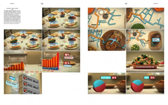
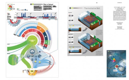
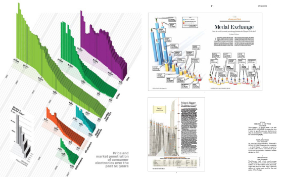
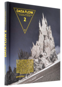
Note: The review copy I received is in French. Unfortunately, I only understand English. So this review is actually my impression of Data Flow: Design Graphique et Visualisation D’Informations as a picture book with titles, which in a way it kind of is anyways.
Last year, the first Data Flow was published, featuring the data graphics of some fine designers. You can read my review of it here. Basically, if you liked the first Data Flow and could use some more inspiration, you’ll probably like this second edition. The two are really similar in layout and in the way the graphics are split up. The title is exactly the same, save the 2.
Data Art
Like the first, graphics are categorized by their aesthetic traits, as opposed to what the data is about: datalogy, datamaps, dataprocess, dataesthetic, datablock, datanets, datacurves, and datacircles. Datalogy are graphics that pertain to health and dataesthetic are works that are more art than data graphic. The rest are self-explanatory. Essentially you’ve got data graphics presented as art.
As I thumbed through the book, I couldn’t help but feel kind of bored this second time around, which might say more about me than it says about the book. I initially thought Data Flow 2 was much more rooted in the art and design aspects of data graphics than the first (because I really liked the first), so I flipped through the first book, and both are actually pretty similar in that regard. I think for me, after seeing so many graphics, especially this past year, a lot of work starts to look the same. So the part about data graphics that excites me the most is the story that the graphics tell, and less about the shapes that are used.
What I’d like to see is a book that categorizes visuals by the stories they tell, like correlation, outliers, relationships, time patterns, and geography.
I do wish I was able to understand the few pages of commentary by Andrew Vande Moere (information aesthetics), Manuel Lima (visual complexity), and Steve Duenes (New York Times) though. Darn my limited American multilingual education.
There is of course plenty of good Data Flow 2 has to offer. There are lots of good examples of of data graphics and data art, mixed with a healthy dose of creative thinking. Many of the examples in the book, you’ve probably seen here on FlowingData.


Also like the first, the book feels nice in your hands. The paper doesn’t feel cheap like some books these days. It is presented like an art book after all.
So let’s put it this way. If you want lessons on how to visualize and analyze data or are only looking for traditional statistical graphics, then steer clear of Data Flow 2. If, however, you’re looking for some inspiration for colors and form or just want some beautiful pictures to put on your coffee table, this book is for you [Amazon link – only 2 copies left].


Thanks for the insightful review, Nate. I was super stoked about this upcoming release and it will grace my coffee table.
I’ve seen and English version of “Data Flow” at Barnes & Nobles. This maybe “Data Flow 2,” which I have not seen.
I’ve had about 25 years of data analysis and model making for IBM,
The data analysis served me as basis to forecastin models for networking products but also for very advanced business opportunities.
For me the first element of a good graphical representation is input data quality
The second element is a good understanding on whish statistical analysis will make this data speak most truthfully about the population(be it people, equipments, or business enterprises)
For example analysing income distribution according ti their levels or mumber of enterprises acording to their number of employees or their yearly income requires special techniques to prepare date before obtaining a valid graphical representation…
For thoes interested, I have published on my website a paper on Pareto distributions” which enable a proper representation of such data on large populations that can be ranked by size and that empirically observed experience all tend to follo a log-normal distribution, Pareto distributions beeing a sub categori of these dietributions in the part of the curve when it is becoming a straight line on a log log scale.
Here is the link, http://trehinp.dyndns.org/prehistautistic/Pareto/pareto_distributions.htm
The article is available in English and in French.
Feel free to contact me for ant question or suggestions to improve this text…
Paul