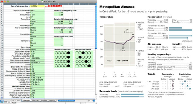
Most people don’t know what actually goes into a good infographic. There’s a lot more to it than just the design. There’s research, analysis, and fact-checking that you have to do long before you open Illustrator. Sarah Slobin, from the Wall Street Journal, explains how to create successful infographics. Have an idea, get the data, choose your tools, edit wisely, and above all else, pay close attention to detail.
The path to successful infographics


Shouldn’t it go:
1. Get data
2. Process/clean up/analyse
3. Find idea
4. Represent idea in most suitable form
i guess it depends on what you’re making the graphic for. in the case of graphics for newspapers, usually you have the idea first, and then you look for researchers who have data.
That’s modern journalism for you.
Pingback: Daily Links for May 10th through May 11th | Akkam's Razor
actually, i practice pretty hardcore old-school journalism.
and i agree, once you have data you gotta respect what it tells you. but don’t you need some kind of focused thought before you look for it to begin with?
I think most of the time you have to have some idea of what you’re looking for. Once in a while, if you get very lucky, you might run across some data that gives you a great idea for a story. With the amount of data out there, though, it’s not practical to wade through it aimlessly.
Pingback: #Tip of the day from Journalism.co.uk – making good infographics | Journalism.co.uk Editors' Blog
Pingback: The path to successful infographics | InfoGraphicsFyi