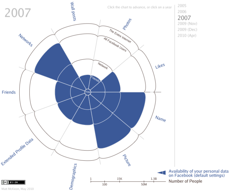
There’s been a lot of hullabaloo about Facebook’s newly installed privacy policies. It started out very closed, to just university students, and has expanded its reach, especially over the past year, to the more public Web. Matt McKeon, of the Visual Communication Lab, explores Facebook’s privacy policies, from 2005 to present.
Rings represent the audience, starting with you in the middle all the way out to the entire Internet. Slices represent bits and interactions you have on Facebook. Click on the image to see how the policies changed over the years for each bit.
Finally, you can also download the code (in the implementation section), which was written in Processing.js. I think I’m noticing a trend. Check it out here.
[via Ben Fry]


While I love the use of a “pie graph” in a constructive way, I’m not quite sure the data is correct.
If you happen to have a facebook friend who is oblivious to facebook privacy and/or technology, then you can test out how much is actually available.
http://zesty.ca/facebook/
This site does nothing more than use the Facebook graph APi (
http://developers.facebook.com/docs/api ) in a clean way.
This data scrape is on the one hand a data dream; but, on the other hand, it’s a privacy nightmare.
I think this vizualisation is hard to understand.
Pingback: Facebook privacy defaults by year : Contrarian
Pingback: Chart shows how Facebook slowly rolled back privacy | zubeta.com
Pingback: Evolution of Facebook privacy policies / what consumes me, bud caddell
V interesting data, but a simple bar chart would have made it easier to read. One’s eyes have to go round in spirals in order to locate the “y” axis values.
Pingback: We Are Facebook’s Product, Not Its Customers » Media Emerging | Scott Hepburn
Pingback: Το Top 5 της εβδομάδας (09 Μαΐου – 15 Μαΐου 2010) | Newsfilter