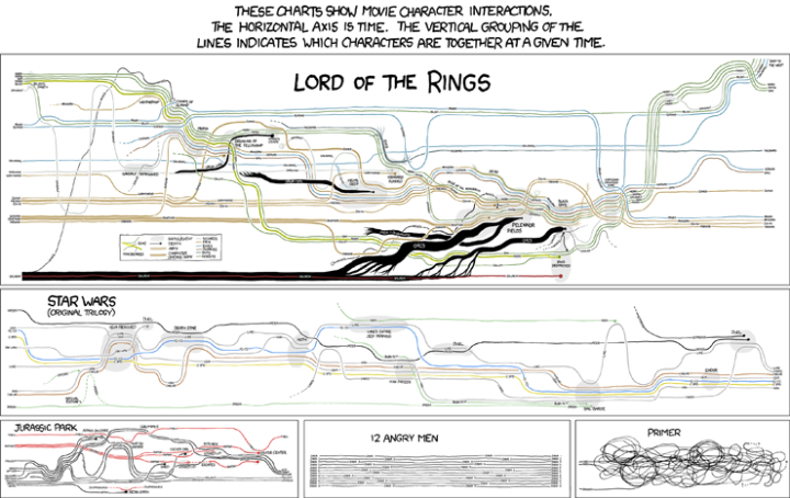
Popular nerd comic xckd takes a look at character interactions over time in Lord of the Rings, Star Wars, Jurassic Park, 12 Angry Men, and Primer. The horizontal axis is time and the vertical axis indicates which characters are together at any given time. The result is something that looks like famed Minard graphic. Well, sort of. And of course it’s all hand drawn, which adds to the nerd-ish charm.
[Thanks, Wesley & Dave & Everyone else]


Pingback: Evolution des personnages de films fantastiques au fil du temps
The one for Primer is classic, maybe a bit too simplified though
Pingback: Fictional Character Interactions Over Time | FlowingData | L1BRAR1AN
xkcd is so great. This one inspired me to put the relationship data in a graph visualization that changes over time. It’s not often I use a comic as a data source so I mashed it right into the interface.
Have a look:
http://danielmclaren.net/2009/11/03/experimenting-with-graph-visualizations-on-a-timeline
Pingback: XKCD: Movie Narrative Charts « WebGlide
Pingback: XKCD: Movie Narrative Charts « WebGlide - Data-Visualization
Fascinating. I’d love to see the Minard graphic for the LOTR books and for Stephen R. Donaldson’s “Chronicles of Thomas Covenant the Unbeliever”.
This is one of my favourites, would like to see something similar for Usual Suspects, or maybe Pulp Fiction.
@xkcd Great work
@flowingdata.com Great site