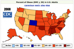
Visualize This: Obesity Rates by State
 This segment of Visualize This is all about obesity rates in America. The data comes from the Centers for Disease Control and Prevention (CDC).
In 2008, every state in the US, except for one had an obesity rate greater than 20%. In 1994, there were zero. Here is the data for 2008. You can find data from 1985 to 2008 from the CDC site. Share your visualizations in this forum thread.
Thanks to all those who participated in the last Visualize This with Rambo kill counts. A little bit of Tableau, some R, and dare I say, Powerpoint. Be sure to check those out in the forums.
Interesting Threads
- Edward Tufte is Talking at the Met – I know many of of you will be interested in this one. Tufte is giving a talk at the Met in NYC on classic drawings. Your ticket comes free with admission.
- Help a Graduate Student Out – Do you collect data about yourself? Take this survey on personal informatics.
- Mapping H1N1 Virus: Pattern of Spread Over Time – Do you have any suggestions on how to improve this graphic? Some put in their two cents while others provided their own work with the data.
- Diseasome, Explore the Human Disease Network – A smooth network graph online to present scientific work.


It appears to spread like a disease. In fact that is one theory: that the increse in obesity is being caused by some type of virus.
On the other hand it looks remarkably similar to that visualization of the growth of Wal-Mart. The increased availability of cheap food is the most prominent theory for the phenomenon.
Nice visualization, too bad the underlying metric is BMI (total crap). So that whole infographic is meaningless.
see, for example: http://www.maa.org/devlin/devlin_05_09.html