This is a guest post from Elad Israeli and Roni Floman of SiSense, which specializes in easy-to-use business intelligence.
Pundits joke that Google Adwords is driving Microsoft Excel sales. Two rivals are vying for domination; yet one’s desktop software is used to optimize keywords sold by the other. The reason is very simple: the Google AdWords interface doesn’t support the rigorous analysis of multiple AdWords keywords and their optimization. Importing the Google AdWords data into Excel lets you do just that… albeit within the constraints of Excel.
Let’s try to explain this by looking at the visualization and business intelligence assumptions behind the Google use case and the Microsoft use case.
The Good News
The Google Analytics and AdWords interfaces have gone a long way towards democratizing the de-facto use of business intelligence practices and good visualization analysis approaches (we’ll ignore the occasional pie chart). Not only does the small business have access to millions of eye-balls through Internet Advertising; it also gets a good lesson in business intelligence, succinctly visualized.
Every non-beginner Google AdWords or Analytics user knows what a dimension and a measure are. These two concepts, key to multidimensional analysis, will soon become household names, courtesy of Google (well, almost). Custom reporting in Google Analytics assumes that once you’ve become acquainted with these terms you can now use them for better reporting, using the custom reporting feature. With the addition of motion charts every user now has access to the visual expression of very complex (time-based) relationships.
The visual that drives the Google universe (although the goal conversions funnels are pretty cool) is the Time Series Chart. Anyone who wants as much traffic as possible into their site is bound to be mesmerized by the Time Series Chart. This includes the author of this article, the publisher of the article, everyone with an online presence. “Hey – look at the spike last Monday, at lunchtime! People must have had their lunch while looking at my site…” Time series charts are what helps you look for trends and see beyond seasonal fluctuations. Time series, together with unstructured data, can be even more helpful, since you can tie the unstructured events (thanksgiving, a press release) to the data and see whether the data may explain some of the seasonality. Google is beginning to hint at this with the notes feature. Posting the unstructured data (press release, new ad campaign) can help you correlate that event to pattern changes in the clicks, visits or any other measure you’re tracking.
The Bad News
So now we know why there’s always that scraggly time series chart indicating traffic, clicks or conversions at the top strip. It is a great solution visually, but it is not good enough to do the continuous improvement work you need to do to optimize your web site traffic or adwords campaigns.
The reason is really simple if you think about it: optimizing web site traffic or ad campaigns can’t be assisted at all by the time series view. It needs a drill down. And a good drill down can be defined as follows: compare as many items across as many measures and dimensions that you can. And this is exactly why you’ll find yourself migrating to excel….
Google did a formidable job of delivering valuable reports. But the ability to drill into pivot-type views (which are best for optimization work) just takes too many steps. And, as we’re going to argue in this article, pivot type views are best when optimizing your AdWords campaigns.
Typically, data is flat, meaning that it consists of columns and rows. A pivot table can help you quickly summarize the flat data, giving it depth, and get the information you want. It does this by offering another level of analysis, across rows and columns. The usage of a pivot table is extremely broad and depends on the situation. To get the right depth, you need to know what you’re looking for, and in an AdWords context, the question you’d like to answer is “which of my keywords/campaigns is most valuable to me?” or, in other words, “how can I rank my keywords, campaigns or traffic sources against each other and compare across the broadest metrics”.
Even with the recent Google release of custom reporting, you can see how certain measures behave over a dimension but not how several dimensions or measures interact. So Google’s new custom reporting feature gives you a very basic pivot. All the defined segments still retain the rigidity of the underlying Google Analytics structure. You can define a segment as an and/or or and+or but not a measured new dimension (a brand new x divided by y), even a simple one such as cost/conversion.
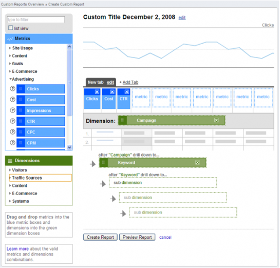
Below you can see the Google Analytics custom report interface – it lets you define what you want in the report (I’m using it instead of directly referring to adwords interfaces).
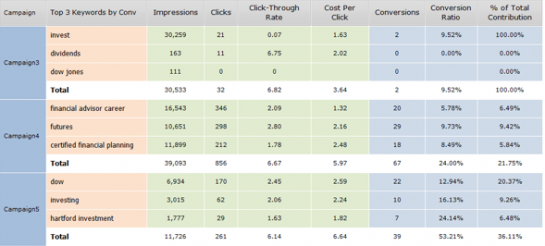
You can define dimensions and get to see measures that apply to them. Yet, you still need to do quite a lot of drill down and sorting to effectively compare campaigns. The reason is that you cannot compare dimensions side by side – you can’t compare the keywords within each campaign, for instance. In Google you cannot see the top keywords (a fliter) per each campaign. You need to always drill down and sort.

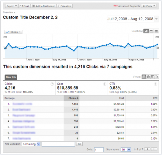
This is the custom report. Comparing campaigns still requires drill downs, not all the information (such as filters) appears. Also, without any measured values we cannot see what a measured value (x/y) for each campaign is, although it is an important measure. So we cannot look at a good KPI, such as looking at the average cost of the worst keywords, which can be an important piece of information when you want to whittle out the bad ones. You can measure yourself by requiring a lower average cost of bottom twenty keywords for every week that goes by.

So you drill down in Google, and define analytics, and use all the reports AdWords gives you, and end up exporting to excel, and using the good old pivot.


“So you drill down in Google, and define analytics, and use all the reports AdWords gives you, and end up exporting to excel, and using the good old pivot.”
Same with AdSense and with Google Analytics. They offer a lot of detailed data, but there’s nothing like a pivot table to see what you’ve got.
Pingback: Posts about Building Website Traffic as of January 7, 2009 | The Lessnau Lounge
Pingback: Using Visualization to Optimize Adwords: Time Series Visuals vs the Pivot Table — 5 Good Stories
This is so true. Creating in-depth reports in AdWords without excel is not possible. You have to download details as .csv files.
Google should work more on comparison reporting too…
How soon before it’s integrated with Google Docs?
Pingback: Using Visualization to Optimize Adwords: Time Series Visuals vs the Pivot Table | Cube9.NET