A little over a week ago, I was in Bremen for the Data Viz VI conference. Read that Data Viz 6 – not Data Viz V.I., as I thought through the first three days.
I asked, “Is this the first one of these?”
“What do you mean? This is the sixth one. That’s why it’s called Data Viz SIX.”
“Ah, ok, I did not get that.”
Anyways, Adalbert and company put together an excellent conference, and I’m glad I was lucky enough to attend. It was the absolute best statistical conference I’ve ever been to. That’s saying a lot, because it’s the only statistical conference I’ve ever been to. But seriously, it was a good conference.
Looking Backward, Looking Forward
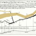
 Michael Friendly opened up with the almost obligatory talk on the history of statistical graphics and where the field is headed. Anyone who’s opened up a Tufte book will have seen a lot of the examples he’s used (e.g. Napoleon’s march and John Snow’s map), but the history behind some of the graphics was interesting. Sometimes statistical graphics tend to lose that back story and becomes all about the values, so it’s always nice to hear the human part of datasets.
Visual Analytics Tools for Analysis of Movement Data
 My ears perked up when I saw “analysis of movement of data” in Gennady Andrienko’s talk. I work with a lot of GPS data. I was reminded of the many ways to split up spatio-temporal data – by geographic section, by chunks of time, etc. It’s easy to get caught up in the literal GPS traces on the map, so the talk was a good reminder. I do, however, wish Andrienko used more dynamic examples and branched out from Google Maps as the primary mapping tool. This was probably because his work is more computation-heavy than focused on interaction. Because of that, I was left wanting more than I got.
GGobi for Exploratory Data Analysis
 I had the chance to chat a bit with the group behind GGobi, an exploratory tool that lets you “tour” multidimensional data via different projections. (That is one nice group of people, let me tell you.) Off the top of my head, there were four separate talks from the group, showing the various applications GGobi can be applied to. It’s kind of hard to explain in brief, so I’d encourage you to check out the free software from the GGobi site. If anything, it’s fun to see your data move ala John Tukey.
Parallel Coordinates – Good or Bad?
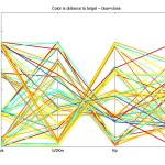
 Al Inselberg promoted parallel coordinate plots (PCP) as the ultimate of statistical graphics. I got the sense that not everyone feels the same way. I remember during my second quarter as a graduate student, I proposed PCPs for a project. I was quickly rebuffed with a no way, those are horrible, and I simply moved on. After getting a personal demo from Inselberg though, I might have to take another look. Although, PCPs are certainly no panacea.
Collaboration Wanted
Still, my main take away from Data Viz VI was the need for collaboration between design, computer science, and statistics. As we’ve seen on FlowingData, there’s a lot of great visualization coming from all three camps, but I wish there were more collaboration between all. As Di pointed out, this can sometimes be difficult because statisticians need certain tools (i.e. R) to be tightly coupled with whatever visualization they’re developing. But outside the pure analytical tool, I see a sweet spot at the epicenter of statistics, design, and computer science, which is certainly something to get excited about.


Pingback: shopyield.com › Bremen…
Parallel coordinate plots may be tricky to set up and use, but they are a very useful way to display multiple variables on one chart. Careful selection of scaling and of order of coordinates makes a difference. You can even create these charts in Excel:
http://peltiertech.com/Excel/Charts/ParallelCoord.html
Hi,
Since you mentioned GPS data as one of the focus of your work I wonder if you can suggest me a good package for geo-data. I have a dataset of time+lat/log elements concentrated in a 600Km x 200km area. As a first exploratory task I would like to simply plot these points in an animated graphic.
Any suggestion of a package to easily project these points in a 2D surface?
Thanks!
Sérgio – i’m not completely sure what you mean by animated graphic, but modest maps, implemented in actionscript, could be a good start.
Thanks, I’ve seen your post on that. I’m going to try modest maps.
My main concern is getting a very precise projection since the locations are very close to each other. I’ll make some tests.