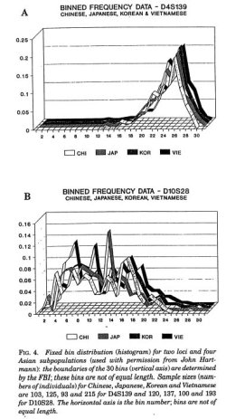
 Karl Broman has an amusing list of the top ten worst graphs found in academic papers.
One of them, very sadly, was actually from the Journal of the American Statistical Association, a very prominent statistical journal. It just goes to show that some have an eye for data, and others might have an eye for visualization, but one doesn’t necessarily lead to the other. Don’t forget to read the discussion on why the graphs are um, not so good, so that we can all learn from the mistakes of those before us.
My personal favorite is the 3-d ribbon graph, because it’s just so ugly. Why would anyone use that? Too many shades of gray mixing, too many lines crossing, too many dimensions. Brain overload.
I guess the graph was made in 1994, so I could cut the authors some slack….
No, they’re just bad. I was making way better graphs in Excel by that time for my seventh grade science fair project — What Cereal do Red Flour Beatles (Tribolium castaneum) Prefer?
Look what you’ve done Microsoft Excel. Apologize for what you’ve done this very minute.
Oh, and they preferred Cheerios and stayed away from the Grape Nuts.

