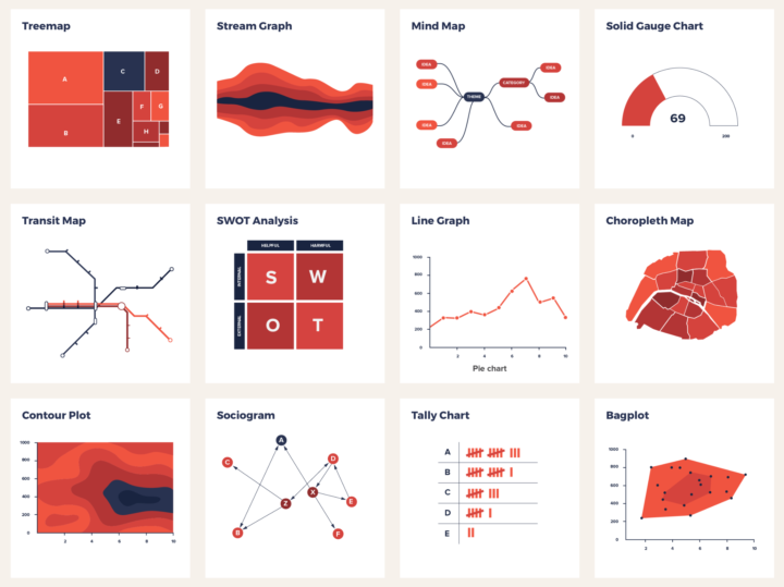
There are a lot of visualization methods to choose from, and it can be daunting finding the right visual for your data, especially for those just starting out. The Data Viz Project by ferdio is a work-in-progress catalog that aims to make the picking process a bit easier. Start with a bunch of chart types and filter by things like shape, purpose, and data format. If you’re stuck, this should help get the juices going.
Catalog of visualization types to find the one that fits your dataset
Second Edition
 Visualize This: The FlowingData Guide to Design, Visualization, and Statistics (2nd Edition)
 Visualize This: The FlowingData Guide to Design, Visualization, and Statistics (2nd Edition)
New tools, refined process.