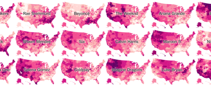
Travel to different parts of the country, and you hear different types of music on replay. Josh Katz for The Upshot mapped the regionality based on the popularity of artists on YouTube.
Of the artists on the Billboard Top 100 this spring, we looked at the 50 that were most watched on YouTube in the United States between January 2016 and April 2017. Each map shows relative popularity in different parts of the country. If one part of a map is lighter, it doesn’t mean people there weren’t watching the artist’s videos; it just means fans were more likely to listen to a variety of other artists.
Nice touch at the beginning: Enter a city or ZIP to listen to the corresponding area’s playlist of popular music as you browse.
See also Katz’s maps from last year for popular television.
 Visualize This: The FlowingData Guide to Design, Visualization, and Statistics (2nd Edition)