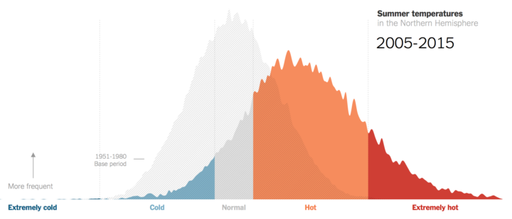
Climate scientist James Hansen and team looked at summer temperatures over several decades. The New York Times charted the increases.
To create the bell curves, Dr. Hansen and two colleagues compared actual summer temperatures for each decade since the 1980s to a fixed baseline average. During the base period, 1951 to 1980, about a third of local summer temperatures across the Northern Hemisphere were in what they called a “near average” or normal range. A third were considered cold; a third were hot.
Since then, summer temperatures have shifted drastically, the researchers found. Between 2005 and 2015, two-thirds of values were in the hot category, and nearly 15 percent were in a new category: extremely hot.


