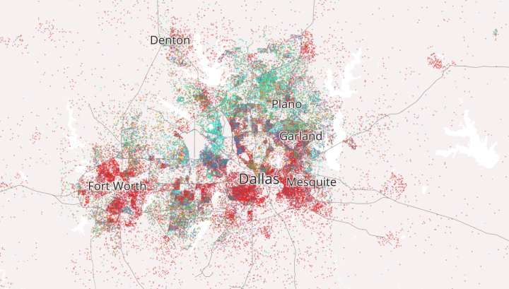
Similar in spirit to dot density maps we’ve seen before, this one from Kyle Walker, an assistant professor of geography at Texas Christian University, uses immigrant data from the American Community Survey to show the makeup of immigrant America.
Each dot represents approximately 20 immigrants in that Census tract from a given region, and the dots are placed randomly within Census tracts. The project was inspired by other interactive dot map implementations including The Racial Dot Map at the University of Virginia; Ken Schwenke’s Where the renters are; and Robert Manduca’s Where Are The Jobs?.
Color represents origin, such as red for Mexico, cyan for South Asia, and green for Southeast Asia.
The tools used to make this map? A combination of R, QGIS, ArcGIS, and Python for data processing and Mapbox for the web presentation.

 Visualize This: The FlowingData Guide to Design, Visualization, and Statistics (2nd Edition)