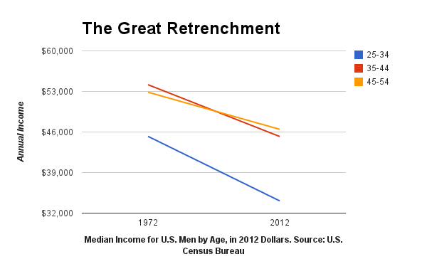
A short post on Bloomberg from 2013 describes the fall of U.S. mens’ income for the past forty years. To illustrate, the author uses the chart above, and we’re like, “Oh gee willikers, that sure is a big drop in income. I guess mens’ income is well on its way to zero dollars. Gosh darn it to heck.”
But maybe we’re riled up for nothing.
Eric Portelance takes a small step back to see what’s going on in this simple chart. It’s the classic case of cherry-picked data points, less attention to axes, and ignoring the details.
 Visualize This: The FlowingData Guide to Design, Visualization, and Statistics (2nd Edition)