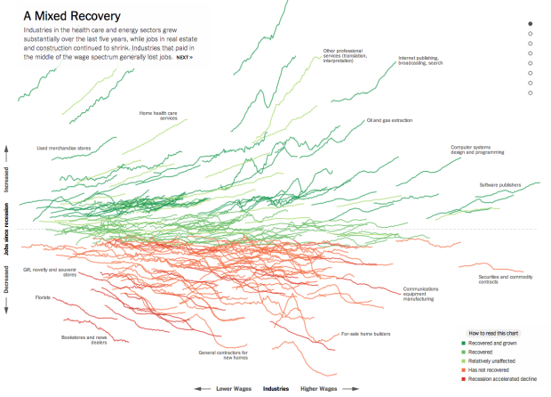
Jeremy Ashkenas and Alicia Parlapiano for The Upshot just plopped this interactive sucker on to the web. Each line shows change in job count for an industry. Horizontally, they’re organized by average salary, and vertically, they’re organized by relative change since the end of the recession. Green represents growth and red represents decline.
My initial reaction was along the lines of what-the-heck, but then you see the axes and get the mouseover actions for details. Scroll down, and you get highlighted subsets. By the end, you’ve learned something.


 Visualize This: The FlowingData Guide to Design, Visualization, and Statistics (2nd Edition)
