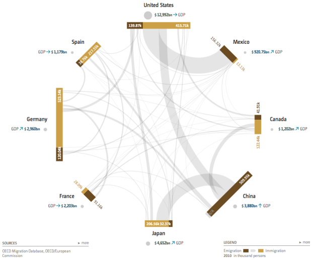
Global Economic Dynamics, by the Bertelsmann Foundation in collaboration with 9elements, Raureif, and Boris Müller, provides an explorer that shows country relationships through migration and debt. Inspired by a New York Times graphic from a few years ago, which was a static look at debt, the GED interactive allows you to select among 46 countries and browse data from 2000 through 2010.
Each outer bar represents a country, and each connecting line either indicates migration between two countries or bank claims, depending on which you choose to look at. You can also select several country indicators, which are represented with bubbles. (The image above shows GDP.) Although, that part of the visualization is tough to read with multiple indicators and countries.
The strength of the visualization is in the connections and the ability to browse the data by year. The transitions are smooth so that it’s easy to follow along through time. The same goes for when you select and deselect countries.
 Visualize This: The FlowingData Guide to Design, Visualization, and Statistics (2nd Edition)