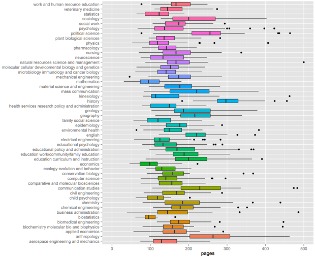
On R is My Friend, as a way to procrastinate on his own dissertation, beckmw took a look at dissertation length via the digital archives at the University of Minnesota.
I’ve selected the top fifty majors with the highest number of dissertations and created boxplots to show relative distributions. Not many differences are observed among the majors, although some exceptions are apparent. Economics, mathematics, and biostatistics had the lowest median page lengths, whereas anthropology, history, and political science had the highest median page lengths. This distinction makes sense given the nature of the disciplines.
I was on the long end of the statistics distribution, around 180 pages. Probably because I had a lot of pictures.
As I was working on my dissertation, people often asked me how many pages I had written and how many pages I had left to write. I never had a good answer, because there’s no page limit or required page count. It’s just whenever you (and your adviser) feel like there’s enough to get a point across. Sometimes that takes 50 pages. Other times it takes 200.
So for those who get that dreaded page-count question, you can wave your finger at this chart and tell people you’re somewhere in the distribution.


 Visualize This: The FlowingData Guide to Design, Visualization, and Statistics (2nd Edition)

As a student at Minnesota, I’m not sure our digital archive is representative, as it is optional, and and certain fields are more or less likely (either due to subject matter, or internal politics) to include their works within the archive. Other than that, this is neat!
what do the colors mean? at first glance I thought the colors had to do with subject area, but on closer examination that are same colored major that are very different (i.e. anthropology/aerospace engineering,
The colors look like they are reverse alphabetical.
Kyle,
thanks – I figured I was missing something super simple – its been a long day.
So the colors are meaningless then?
Yes, the colors are useless. They convey no information that is not already transparently conveyed.
For that matter, the box plot itself is thoroughly obsolete. Read Edward Tufte’s books, specifically chapter 6 of “The Visual Display of Quantitative Information” for the description of the successor to the box plot.
As for the topic of the post, my math dissertation was 88 pages. My advisor’s was (not a typo) 23 pages, double-spaced, including front matter and references.
And Presburger’s was 19 pages or so. But his supervisor, Tarski, would not give him his PhD. He thought the thesis was too short. So there is a lower bound.
would be interesting to see if they have been getting longer over time and by how much by subject
The chart would be more useful if the majors were ordered by median or average dissertatin length. But it is interesting to note that the more mathematical and objective the mayor, the less pages needed. Llongest dissertations: sociology and anthropology. Shortest: biostatistics.
Out of curiosity, Nathan, what was your dissertation on? (Not that I’d understand it anyway!)
Then, there are the departments’ or universities’ format standards. Single spaced? Double spaced? That, of course doubles the plage length. Better, what was the word count in the dissertations?
So with the current trend of dissertation chapters being prepared/formatted as manuscript submissions for journals up front (which have limits to the manuscript length), I would expect to see overall dissertation lengths get shorter over time (to present). Mine started out much longer, but as I started conforming to target journal format standards, I would say the overall length was reduced by a third or so. Is this true outside of ecology as well?
Oh, dear, my dissertation wouldn’t even appear on this chart, but would be off the right edge. And yes, I’m in one of the ‘runs long’ disciplines. Then again, my opus would count as short for, say, a German Habilitation or a French These d’Etat in my field, so it all depends!
This is very interesting. One variable that isn’t accounted for, but varies greatly between institutions and individual authors, is the number of words per page – determined by spacing, margins, font size, and so on. A more helpful plot would count theses by words, instead of pages, as a measure of content.