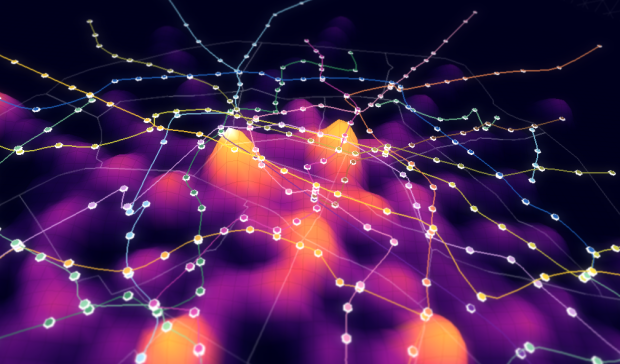
Data visualization group Dataveyes looks closer at the Paris metro system from a time and crowd point of view.
This visualization offers to challenge the way we traditionally view our 2D metro maps. Métropolitain takes on an unexpected gamble: using cold, abstract figures to take the pulse of a hectic and feverish metropolis. The metro map is no longer arbitrarily dictated by the spatial distance between two points. By playing around with two extra variables — time and crowds — users can transform the map, view it in 3D and unveil the true reality behind their daily commute.
No doubt inspired by the Travel Time Tube Map of the London Underground by Tom Carden, Métropolitain lets you select a station and the lines morph to represent how long it takes to get to other stations. A layer underneath is a heatmap that shows annual incoming traffic per station.
Finally, you can switch between 2-D and 3-D. I’m not sure if the extra dimension adds much from an understanding point of view, but it is fun to play with. [via infosthetics]
 Visualize This: The FlowingData Guide to Design, Visualization, and Statistics (2nd Edition)