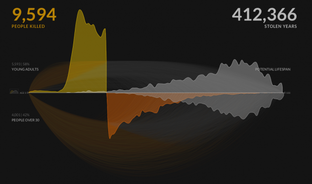
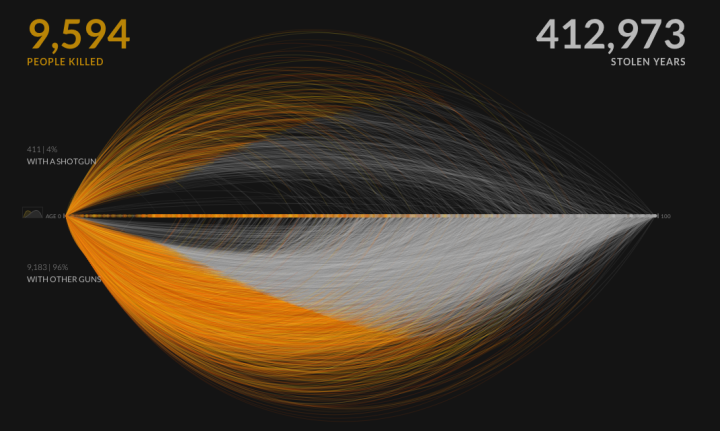
Information visualization firm Periscopic just published a thoughtful interactive piece on gun murders in the United States, in 2010. It starts with the individuals: when they were killed, coupled with the years they potentially lost. Each arc represents a person, with lived years in orange and the difference in potential years in white. A mouseover on each arc shows more details about that person.
You can then select categories and demographics, which provide comparisons between ethnicities, gun type, sex, and others. Roll over the bar in the middle for a density plot representation.

Finally, specific breakouts on the bottom provide notables in the data and what they mean.
There are many routes that you could take with this data. At its core, it’s a multivariate dataset with many observations over an entire year. But Periscopic pays close attention to the context and the sensitivity of the data. They make the data relatable while also providing a view of the big picture—without stripping away what the data means. See it live here.


 Visualize This: The FlowingData Guide to Design, Visualization, and Statistics (2nd Edition)

All very heart-wrenching. I’d ask – how many $billions in property crime were saved and how many lives were SAVED by all those ‘years potentially lost’? Considering “From 2003 through 2005, 1,662 murders were committed in New York. … More than 90 percent of the killers had criminal records; and of those who wound up killed, more than half had them.” (http://www.nytimes.com/2006/04/28/nyregion/28homicide.html?pagewanted=print) so roughly 90% of those ‘years lost’ were years of either crime or incarceration. Kind of puts a little less bleeding-heart spin on it?
The best response to this comment comes from Joe Strummer:
“If death comes so cheap, then the same goes for life.”
Perhaps it’s time to give more thought to what the years *could have been* instead of using stereotypes and assuming the worst in people.
If more than 90 percent had criminal records, that kinda kills the myth that guns are mostly used by law-abiding people to defend their property…
(p.s. those figures are for New York only, which is the largest and least typical city in the US – got any stats more representative of the nation as a whole?)
I’m not sure what’s the point of that comment, or the value of that statistic, myth or not? I mean, if only 10% of the shootings were people defending their homes, does that mean it’s *better* if the state removes the private citizen’s ability to defend themselves? I mean, the assertion is then that we can spare that 10%?
That’s not necessarily true at all. You may be assuming that all law-abiding people using a firearm to defend their lives actually shoot at AND kill the perpetrators seeking to do them harm. In reality, many cases of self defense involving the use of a firearm go unrelated for a number of reasons, notwithstanding the need to explain to police why they felt the need to use deadly force against another human. That opens people up to lots of scrutiny where they might otherwise just go on with their life.
edit: of course, FIFTY percent of the years lost were of criminality. Basically, killers are killing other criminals most of the time.
I found some details rather funny (in a horrible way): a boy who’s been killed at 16 had their entire lifespan estimated in… 17 years, because he’d day a year later of external causes. Cases like that have the opposite effect that the desired.
Really not trying to be inflammatory; I do understand this is a sensitive issue.
I wonder if you could do this same thing with people saved by guns and years saved?
Would be also interesting to see how many of the killers obtained the gun legally vs. stole/bought on the black market/borrowed from relatives.
Chart is misleading.
Years lost assumes that victims of gun violence are like everybody else and have a normal life expectancy. It is more reasonable to assume that they engage in other risky behaviors likely to shorten their lives. In short, many of them would die anyway.
Also misleading is the number of people who died of gun violence who would have died of other causes, always a very small number, e.g. 750 die of gun violence and w/out guns only 10 would have died. Well, sure, but while the numbers of people who die of gun violence is large in absolute terms, it is still a small portion of the population. A more accurate number would be the number who actually do die of other causes, e.g. 750 die of gun violence, but 2500 die in car accidents.
A large proportion of gun fatalities are suicides. I don’t know if its proper to call these gun deaths “murders”.
I believe the chart is designed to convince me, a middle-aged person who doesn’t engage in criminal activity, that I, or members of my family, are in danger of being shot by a gun. I would like to know if this is really true, but the chart doesn’t really tell me that.
I would like to see some figures on gun violence which take out instances of criminals shooting each other and suicides. This would help me evaluate these policies. I am sorry if this sounds cold. I think all of these deaths are tragic, but I think that different policies are required for them. Legalizing most drugs would lower the rate of criminal violence for example, and better psychiatric care would lower the suicide rate.
Why focus on only gun murders? What about those murdered with other weapons, including fists? These are more than 30% of the murder victims? Are their lives less worthwhile somehow?
@Kevin: thus the disingenuousness of the chart, which is ostensibly about life and loss, but is in fact a poorly-disguised political (antigun) screed. One can apparently be political and tendentious with charts as with anything, which is pretty much Tufte’s point, too.