How wealthy are the richest people in the world? How do they compare to each other, and how does their net worth change over time? Bloomberg just put up an interactive tool to answer such questions, and it’s updated daily with new data.
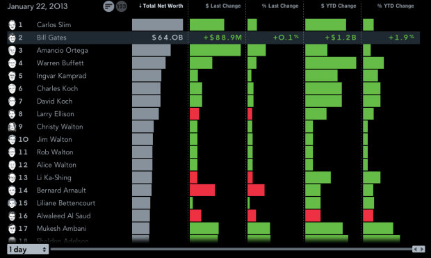
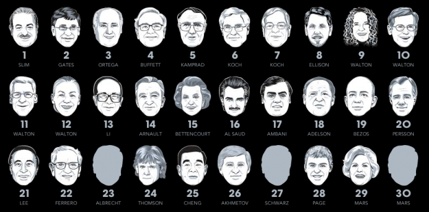
There are four main views. The one above shows rankings, their estimated net worth, and the change from the previous estimate. Below is a simple ranking of the world’s billionaires. Each floating head is clickable so that you can more information about the individuals, such as a short bio and where there money is from.
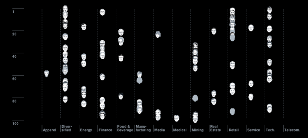
It gets more interesting when you click around and explore. For example, there’s a plotting view, and the floating heads transition to their sectors, still sorted by ranking:
There’s also a bubble map that you can modify to show the metric you’re interested in:
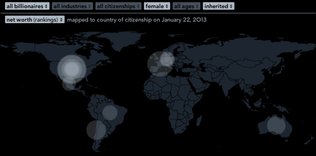
Finally, a set of filters and a time slider on the bottom ties it all together. Filter by gender, industry, citizenship, age, and whether or not a billionaire’s money was mostly inherited. The slider on the bottom allows you to go back in time to see rankings and net worth change. That part did seem buggy though, as heads seem to disappear or get stuck if you shift too much.
Overall: There’s a lot of interesting things to look at and explore, and it works well as a tool. The next steps would probably be to provide pointers and annotation since you have to do most of the searching yourself in this form (but I don’t think that’s what they were going for).
Give it a go here.
[Thanks, Kenton]
 Visualize This: The FlowingData Guide to Design, Visualization, and Statistics (2nd Edition)
Why isn’t Michael Bloomberg himself on their (Bloomberg’s) list? By Forbes listing he is #10 on the Forbes 400 and #20 in Billionaires. http://www.forbes.com/profile/michael-bloomberg/
Bloomberg LP has a policy of not covering Michael Bloomberg himself:
http://www.bloomberg.com/news/2013-01-18/bloomberg-billionaires-index-methodology.html
This just confirms what I always thought: Mitt Romney is a loser!
why not adding Michael Bloomberg
why not adding any black to the top 20 list