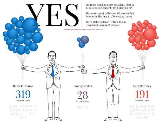
In the same spirit of the quick update site on Olympic records a couple of months ago, the Guardian and Real Clear Politics tell you if Obama is still president and if Romney is president. Each balloon represents a state, sized by electoral votes, and the number of balloons in each hand represent projected voting, based on current polls. Straight to the point.


 Visualize This: The FlowingData Guide to Design, Visualization, and Statistics (2nd Edition)

I’m guessing “Strong [candidate]” means that the outcome in those states is so guaranteed, that they don’t bother doing expensive accurate polling that would give comparable data to the other figures?
It’s a shame that all the balloons aren’t coloured to match the swing one way or the other. I don’t know much about US politics but I know that Florida (+3.2%) is still not completely in the bag while, say, California (+20%) realistically is, while here they’re both pure blue balloons.
You can find this stuff out by hovering over every circle but it’d be nice to just be able to see it to know where to browse. Having hues as they are and opacity mapped to distance from 0 (between say 70% and 25% opacity) would be a useful, simple guide on where to explore.
Pretty nice use of network node diagramming :)
I agree there could be a little more info, encoding by color perhaps.
But it’s pretty cool as an entertainment visualization