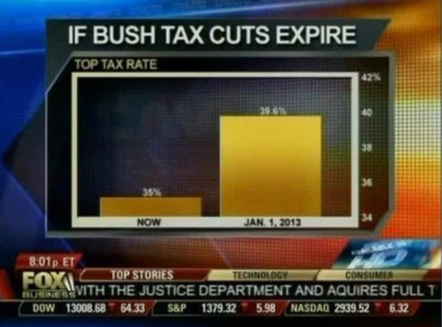
Fox News tried to show the change in the top tax rate if the Bush tax cuts expire, so they showed the rate now and what’d it be in 2013. Wow, it’ll be around five times higher. Wait. No.
The value axis starts at 34 percent instead of zero, which you don’t do with bar charts, because length is the visual cue. That is to say, when you look at this chart, you compare how high each bar is. Fox News might as well have started the vertical axis at 34.9 percent. That would’ve been more dramatic.
Here’s what the bar chart is supposed to look like:

With a difference of 4.6 percentage points, the change doesn’t look so crazy.
[via Effective Graphs]
 Visualize This: The FlowingData Guide to Design, Visualization, and Statistics (2nd Edition)
There really doesn’t seem to be any reason to use bar charts here at all. There are two data points. I guess I don’t see what value the bar chart adds – is 4.6 percent so hard a concept to grasp that we need to show it visually?
For those at Fox news 4.6 IS hard to grasp.
They don’t have 0.6 of a finger…
The fact that it is only two data points is no reason *not* to chart the data.
This is done all the time…if you want to compare two measures, a bar chart is a great way to do it.
4.6% is not a hard concept to grasp, even for most Fox News viewers, I’m sure, but
1) the goal of all news is to present to the lowest common denominator, and
2) showing a visual representation of the data will implant the concept in the viewer’s mind
So, showing a skewed chart that lies about the data is a great way to show the real number while implanting the wrong comparison.
Because saying, “…an increase of 4.6%” isn’t as scary as making it look like it’s going to increase by 5 times. People will look at the graph and see the big difference without looking at the numbers. I’m surprised they didn’t divide the chart by a tenth of a percentage point so it loos even more astronomical.
Which font did you use in your version of the chart?
Looks like century gothic to me.
Of course, Fox news knows exactly what it is doing. If this was about Obama *cutting* taxes, they would have made the “correct” graphic.
As to Trevor’s question, yes, 4.6% may be a difficult concept for a majority of Fox news watchers.
A more neutral way to describe it would be that taxes would rise 15%.
13%, actually
Whether a bar graph is used or not to convey the difference of 4% is irrelevant. The point is they’re using the bar graph incorrectly in order to portray the difference as much larger than it really is in order to push a political agenda.
Reminds of me of the Daily Show’s growth in misleading charts….
Notice too that they spell like they draw charts. I like the running ticker or acquires vs. aquires. Oops
I must admit that I am disappointed that Fox News used a misleading chart to push what they wanted. They should have started the visual axis at zero. Although this is true, there is the 4.6%. Not that that is a huge deal, but there IS that 4.6%.
They should add the first and lowest rate (1913 @ 7%) and highest historical top marginal rate (1944 @ 94%) for a true sense of scale. Or they could just update and show the third chart from this page:
http://visualizingeconomics.com/2010/02/04/historical-marginal-income-tax-rates/
Nathan, I agree that truncating the lower end of the percentage value domain is bad practice – for all the reasons you and the others have mentioned. But I wonder, as I look at your “should” graphic, should we also not truncate the upper end of the domain? Politics notwithstanding, tax rates can take any value between 0% and 100%, so wouldn’t we make our best comparison when the data are plotted against the full domain?
A clear manipulation of data to suit Fox’s right-wing agenda. Good work, FlowingData. Keep up the naming and shaming!
Even the bar graph is misleading, with all the suggested bells and whistles. The 35% and 39.6% are marginal tax rates, only paid on certain portions of income due to compensation for certain kinds of work. No one pays 35% taxes, including those people who earn millions of dollars. Many of these people pay closer to 15%.
So, I guess you could argue that the better produced graph is technically produced, but given the context of this particular set of numbers, it’s better to do away with the graph and focus attention on effective tax rates.
But I do agree, Fox News does produce skewed graphs intended to obfuscate.
In my opinion, there should be a law against misinformation. With severe punishments.
Can I have your 4.6%, then, or would you be willing to pay mine?
liberals are funny.
American politics is funny! You guys have got the culture wars thing so bad, that whether you like charts to be misleading or not has become a marker of which party you support… Seriously guys, you need higher standards in your reporting!
Did anybody else notice that they spelled “acquired” wrong on the bottom bar?
This is so typical of FOX news! there is a guy at work who is always glued to FOX news! He always changes the chanel in the lounge to FOX! he says that we all need to see FOX to balance us out because without FOX we would all be unbalanced with only have half the story. Meanwhile we never get to watch anything news or otherwise because there is FOX on all the time!!! People like this make the world dumb!! He thinks we should kill all middle easterners because we can not find the REAL THREAT! The real threat is FOX!!!!
There is a problem with the graph shown that represents the tax increase after the Bush tax cuts expire. The logical fallacy I picked up on is polarization. The misleading bar chart shown exaggerates the actual difference between the current tax rate and after the expiration of Bush’s cuts. Based on the bar chart one assume that the tax rate would increase by about 5 or more times, while in reality it would only increase by a small 4.6%. The skewed bar chart would lead a voter to choose their position on the election based on exaggerated data and that is where the issue arises.