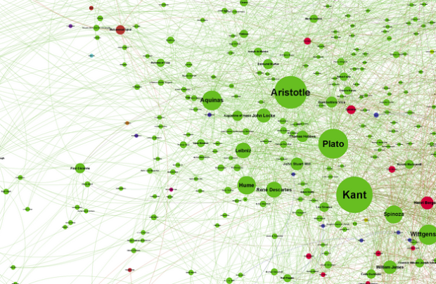
Brendan Griffen created a giant network of people, using every profile on Wikipedia that had an “influenced by” or “influences” field. Each node represents a person and is sized by the number of links going in and is colored by genre.
It really is fascinating (to me at least) to start at one node and bounce along the connections to a distantly related someone else. People in philosophy influencing fantasy writers who influence comedians. It shows one thing above all: the evolution of ideas is a non-linear process. We too, are somewhere in this web, albeit at a smaller scale. We too, are the sum of many.
Be sure to check out the easier to read and browse zoomable version. Also available in print.
 Visualize This: The FlowingData Guide to Design, Visualization, and Statistics (2nd Edition)
From the looks of it, it’s made with Gephi, and in the zoomable version you can see that he quite likely used a Fruchterman-Reingold layout. I love how regular this layout looks when laying down web related data (keywords, traffic sources, etc.) Beware that neat looks are one thing, Force Atlas is usually more useful since it has a strong tendency to break big connected chunks apart.
Ruben
Yep you’re right! It was made with Gephi. I wanted to use some other algorithms but my little desktop couldn’t handle it. I have access to a supercomputer now so we’ll see what I can come up with in future. Stay tuned.
I posted a recipe demonstrating how to grab “influence” data from DBpedia/Wikipedia and pull it directly into Gephi here: http://blog.ouseful.info/2012/07/03/visualising-related-entries-in-wikipedia-using-gephi/ The technique generalises as a way of pulling all manner of graphs from structured Wikipedia data into Gephi, and as a side effect offers a way of pulling graphs representations out of DBpedia and saving them as a graph file..
This graph reminded me of this episode of 99 percent invisible: http://99percentinvisible.org/post/26096318377/episode-57-what-gave-you-that-idea
I’m very confused by the colors. What is Green vs. Red? Or yellow vs. orange?
From the author’s site. Red – 19th/20th century philosophers, Green – antiquity & enlightenment philosophers, Pink – enlightenment authors, Yellow – 19th/20th century authors (~fiction/philosophy), Orange – fiction author, Purple – comedians. There are a few other groups like religious leaders, film directors etc, but those are the main ones.
I would love to see this done in science using Pubmed citations
Check back to my site soon – you may like one of my upcoming posts. :)
i want to click on one dot and have the connections highlighted; i guess it is pretty though
How can a graph of every idea in history by influence be so under represented in science?
Every*
It looks like philosophy is one big circular argument.
As with most western scholarship, this is SO ethnocentric……where is Lao-tzu and why is he less important than Socrates…similarly where is gautama shakyamuni or mahavira???
Please read the original post. Many influential people have been left out, not just Lao-Tsu. Cave painters, the first agrarian farmers, the inventors of the wheel etc. There will never be a graph which will be accurate unless you included everyone who has ever been.
Note that the original idea back to Simon Raper ( http://www.drunks-and-lampposts.com ). We offer a French version of his post here: http://pegasusdata.com/2012/08/05/analyse-de-reseau-modeliser-lhistoire-de-la-philosophie/ . On this occasion, several historians of philosophy have left comments about consistency – or not – of such an approach which is based on a very incomplete source (wikipedia) and forget the qualitative relationships of influence between philosophers.
That said, this work of Griff’s simply amazing!
Similar to “where are the non-white people”: where are the women? You can’t call this a graph of “every idea in history” if you restrict “history’ to mean “stuff thought up by white dudes”