Information visualization firm Periscopic, in collaboration with GE, explores the makeup of the American workforce, from 1960 to present.
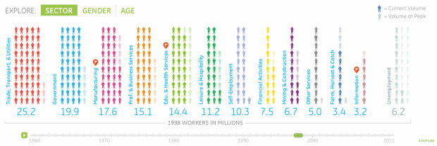
Jobs are definitely a top of mind subject. Did you know that manufacturing jobs were the largest sector of employment in 1960, yet today the category has fallen to 6th place? In this interactive visualization, browse who has been working in America over the past 50 years by sector, gender or age.
As in other Periscopic projects, the interactive provides multiple views that let you see the data from different angles. The initial view is a current breakdown of sectors, and when you press play, the visual rewinds to 1960, animating forward in time. Faded people icons represent the peak of each sector for context. Then as you might guess, the people rearrange themselves accordingly when you select breakdowns by age or gender.
You can also have a look at the entire trend via stacked bar graph.

The stacked view is hard to decipher actual differences because of the vertical offset, but never fear. When you click on a category you get a year-to-year comparison between 1960 and now. Good work as usual, Periscopic.
 Visualize This: The FlowingData Guide to Design, Visualization, and Statistics (2nd Edition)
Not sure I like the faded Volume at Peak figures. I don’t think there is enough contrast with the colours for Current Volume. I know its boring but I think the information would be conveyed better if each sector (or gender or age group) was represented with a bar. The height of each bar could correspond to the Peak Volume but be filled in colour up to only the Current volume.
For the All Years part they could have implemented a line graph for each category (plus a total) with the ability to turn each category on or off.
Having said all that, there has clearly been a lot of work put in to this and there is some very nice interaction.
Over the last 50 years, the number of government workers increased 260%. It took me more than a few seconds to find that nugget. Still, this is an excellent interactive tool. Thanks for helping to explain some of how it works.
I think they have the unemployment figure incorrect on the sector graph (current unemployment is not 13.7%) – it appears that they summed the individual totals from the age or gender pages – unfortunately, each group has a different denominator so summing the percentages is wrong.
It is interesting to watch the government sector grow and the manufacturing sector slide down the list as time passes…
@Time Traveler: the Sector graph shows number of workers (in millions) not percentage.
Thank you for clarifying – I should have read the axis label more carefully.
To me this is a classic example of the information getting lost in the animation. In my opinion, the whole time series could be more clearly displayed in a single plot showing the number employed in each sector over time using different colored lines. Better yet, display the percentage employed in each sector, to really highlight the changes over time, regardless of the growing population of workers. In this plot, it would be easy to see in one glance, what sectors increased or decreased over time.
I agree very much with the view that percentages would be much more useful in showing changes over time -the first thing I did with the ‘millions’ figures for gender was some mental arithmetic to convert to percentages !