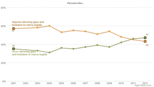
Regardless of your politics, this chart is a great example of how data can tell a story. It’s a very simple graph by the Pew Forum on Religious and Public Life showing the changing attitudes about same-sex marriage. It shows that in the past couple of years, people have begun to be in favor of same-sex marriage.
I’m showing this chart because it so clearly represents the story of the data. The eye is immediately drawn to where the “oppose” and “favor” lines cross. Other obvious choices for this data would have been a stacked bar chart or a side by side bar chart as shown here (which I created with the source data just as examples):

These two charts are fine, but they really don’t tell the story of what’s happening. They merely present the data. The viewer has to take the time to look at each year and detect the year where there’s a flip. The flip is much harder to see in these two graphs.
It goes to show that even in the most humble charts, we must choose wisely to convey our message.
 Visualize This: The FlowingData Guide to Design, Visualization, and Statistics (2nd Edition)
Minor note: I’m colorblind, and the particular green and orange chosen here are virtually indistinguishable to me. Generally it’s nice to use different values as well as different hues for those of us who have trouble discerning certain contrasting hues.
Another one for me is red marks on greenish brown satellite photos…
I’m in the same boat as Hig. It took me a long time to figure out what the first bar chart was showing. It just looks like a single bar for each year floating around 90%. It kind of adds a new meaning to the last sentence. Otherwise a great post.
Thanks for bringing this up! Good information.
Ah, interesting. I was always told it was red/green. I will have to be more vigilant. I was also following the colors of the original post for consistency.
The issue here is red/green colorblindness. Basically this means that the red and green components of the color are not as distinct for us as they are for most viewers. The difference between these colors is the relative balance of red and green.
I took a rough attempt at quantifying it with the particular colors here(aprox rgb(170,182,70) and rgb(254,154,57)). But if you assume the three colors contribute equally to the value, then it doesn’t line up… the orange should be brighter than the green. I’m not familiar enough with details of how screens work to know whether this is standard or not… I’m viewing on a MacBook Pro 15″ LCD. I wonder if other colorblind viewers on different screens are seeing the same issue? Anyone still on a CRT out there?
As a market researcher, I really appreciated this article. Thanks.
This is a wonderful example Kim.
Well of course simple charts can tell a story…usually much better than the needlessly complex charts that clutter the media.
There are reasons to add complexity and levels of story telling,of course, but when the data is clear, let it speak clearly.
Any ideas about what happened in 2004-2005 to cause that first shift? Bush’s re-election?
Will and Grace
Why does it not add up to 100%? I was confused by the fact that the lines don’t cross at 50%. I was sufficiently distracted that I thought I was not understanding the “story” correctly!
People who are neutral.
I cannot see any reason for presenting the data as a stacked bar chart. The numbers that are obvious from the stacked bar chart are the number that favour and the total number that favour or do not favour.While the former is interesting the latter is not. You cannot at a glance determine the number that oppose or whether those that oppose outnumber those that are in favour for any given year. I know this is basically what you are saying in the article, I just cant agree that the stacked bar chart is “fine”, it is considerably less effective than just presenting the data in a table.
To be accurate, simple charts are more likely to tell a story. In fact, the best charts – those that communicate with ease – tell a single, explicit story (e.g. Cocoa product up!).
You should be able to summarise the chart’s title in a sentence or phrase (“The majority of people are now in favor of same-sex marriage”). If you can’t do this, then probably your graph is too complex. Usually it’s just reference data jammed onto a chart and should be left in the table where it’s happy.
Remember the Golden Rule of Graphs – Graphs are like jokes. If you have to explain them, they’ve failed.
Powerful! Also look at when the opinions diverged the greatest. A pattern is revealed during each national election year. My hypothesis is as each parties candidates fired the voters up over those points of contingency they further divided public opinion. The chart tells many stories.
This is an excellent chart for teaching first year Data Science students how to choose a chart. What the students will WANT is a list of rules like “always use line graphs for time data” or that sort of thing. However, really we are trying to teach them to discern, to weigh, to consider. What I like about this posting is that the emphasis is less on justifying the choice based on a rule that they’ve memorized and more about comparing the results from two choices.