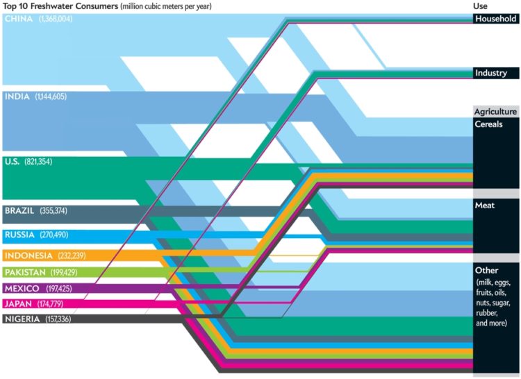
This Scientific American article by Mark Fischetti and infographic by Jen Christiansen detail the consumption of water usage throughout the world. Jen used a Sankey diagram to show the top 10 water consuming countries and how their water was being used. One of Mark’s first points in the article is that population is the largest factor of water consumption. So I wonder why population adjusted numbers weren’t used. Many of the article’s commenters felt the same way. One posted a few of the countries per capita water use:
China: 2781 lts/day, India: 2591 lts/day, US: 7175 lts/day, Japan: 3752 lts/day
The way you display your data depends on the story you’re trying to tell. In this case, I wonder if the message could be better by using per capita.
[via @ChristiansenJen]

 Visualize This: The FlowingData Guide to Design, Visualization, and Statistics (2nd Edition)
Per Capita Consumption would help to normalise the data, but you would also have to factor in the embedded water in exports such as (but not limited to) foods. This represents a hidden story where, for economic reasons, countries are using water as a factor of production in what they export, but in some cases can ill afford to use.
Thanks for the pickup! I actually did the graphic. Mark Fischetti wrote the text. Which might explain part of the disconnect: 2 authors. Check out the comments section of the SciAm page. You’ll see that I posted a link to the source paper for folks interested in seeing more data.
Thanks for the clarification, Jen. I’ve updated the post.
And yes, Mark Q’s comment does nod to part of the issue with showing per capita information. We wanted to address the idea of net exports and imports. (In earlier sketches, it was included as a visual element on the larger Sankey diagram, but we didn’t have *all* the data points on that front, so it was scrapped, and the top exporters and importers are represented in a separate chart on the page).
Why not normalize consumption to GDP ?
How would GDP be a better normalization?
Despite the overconsumption of the United States, it is overshadowed by an even larger problem. Exploding population growth. It think the data clearly demonstrates this. Attempts at conservation are futile in the face of growing populations. In general this is a semi politically incorrect issue to address (world population growth) but it’s every bit as important as addressing global warming and depletion of natural resources. The US bears it’s own responsibility but per capita consumption numbers hides another problem.
As per Mac, I don’t think that looking at the data per capita (whilst an interesting story about efficiency) is what this story is about. Fresh water is a reasonably finite resource. As the population in China and India increases the blue bands will get bigger. More worryingly is that if they were to only use twice as much water per capita as they are at the moment the blue bands would get massive. Think how big they will be if they start to come anywhere near Western consumption. So an extension to the graphic showing a realistic scenario in the future would look very scary. It would have been helpful to add a European country for comparison (they’re not presumably in the top 10). And I’d be interested to know just how much fresh water is readily accessible in what countries and what regions. i.e. we’re using a lot but how much of a problem is it? A different graphic for sure but there seems to be many stories to tell.
What is this type of chart called?