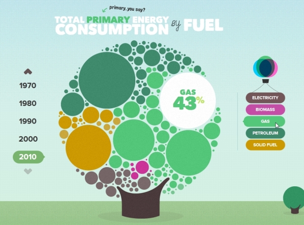
I’m a sucker for anything cute and bubbly, and the U.K. Energy Consumption Guide created by Epiphany is no exception. It combines a vertical scrolling site with a lot of data visualization about different types of fuel and how they’ve been used historically. Most of the charts are solid and the interaction adds an even higher level of clarity and understanding.
While I like this circle packing chart, I’m sure there will be doubters. It’s very similar to McCandless’ natural gas visualization that received a lot of flack. But generally speaking, anything that is engaging and welcoming garners a little extra time from the visitor to make sense of it.
 Visualize This: The FlowingData Guide to Design, Visualization, and Statistics (2nd Edition)
They could include some definitions:
“Electricity” — generated how?
“Solid fuel” coal?
Biomass — in the UK would that be peat, firewood, what?
Last, is the UK really nuclear free?
Definitely – and electricity isn’t usually thought of as primary energy, since you have to make it somehow. My best guess is maybe that’s their way of accounting for renewables (wind, solar) since many renewables don’t make sense in terms of primary energy?
Besides that I overall have to disagree that it’s a useful visualization – the tree mentioned in J’s comment below took me way too long to understand that the sub-bubbles didn’t have additional meaning. Or, take ‘Final Energy Consumption by Sector” – mouseover, and the donut chart spins into a new donut chart with a bigger, filled center that appears to have the same sector breakdowns, but now narrow and rotated and with the sector labels now hidden….
I’d say that it has the benefit of being far more attractive and…cute…than McCandless’ visualization.
Other than that…well….it’s like a pie chart that’s had it’s only shreds of effectiveness take away by turning each section into un-ordered bubbles that are gratuitously broken up into sub bubbles for no apparent reason…
I understand the point of making it fun and attractive…but at the very least, replace the accompanying useless tree map with a bar chart for those who would like to see an effective visual comparison.
I agree, that treemap is pretty poor.
Is it me or the first graph has an error?
When you select 1990 the gas looks to be the bigger area but has only 24% while petroleum has 36% and solid fuel has 31%. And if you add all the percentages, the total is 99%…
And why do we need to move the mouse on the words to see the percentages? It would have been better to see the percentages directly on the circles.
Well, to my mind, this data visualization is dynamic and beautiful, but not very useful.