I’m pretty sure I’m not in their target audience, but my main takeaway from this video is that now, with easel.ly, you don’t need time, money, or skill to make quality infographics. And the prezi-like video seems fitting.
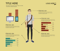
 Maybe I’m just stuck in my ways, but I’m having trouble getting on board with these tools. Easel.ly, for example, provides themes, such as the one on the right. There’s a guy in the middle with graphs around him and pointers coming out of his body. You get to edit however you want.
So in this case, you start with a complete visual and then work your way backwards to the data, which I’m not sure how you can edit other than manually changing the size of the graphs. (Working with the interface takes some patience at this stage in the application’s life.) It’s rare that good graphics are produced when you go this direction.
Instead, start with the data (or information) first and then build around that — don’t try to fit the data (or information) into a space it wasn’t meant for.
Or maybe there’s a lot more in store that we can’t see yet. Either way, right now, the application is rough at best.

 Visualize This: The FlowingData Guide to Design, Visualization, and Statistics (2nd Edition)

This time next year no one will remember what an infographic is anyway.
http://www.google.com/trends/?q=infographic,+visualisation&ctab=0&geo=all&date=all&sort=0 Just saying…
(doesn’t change the fact that this is just a lame online clipart library. infosthetics have reveiwed a few other tools like this that are more interesting – exporting as semantic pages rather than images and with actual features that use actual data…)
I’m not so sure anyone remembers now – they’ve got them confused with plain old PR posters. A pretty presentation of random factoids is not the same thing as a graph that is shaped by information, expressing it in a way that gives new & better insights.
Hacker News seems pretty unimpressed:
http://news.ycombinator.com/item?id=3970251
After running through he online beta version, here is my take:
Esel.ly seems to be a simple slide show generator that is being marketed as an “infographic” tool and falls short so far. It provides a very limited graphic library. Ascii data must be entered directly by the user. There are no import or integration methods for data ingest or processing.
With the exception of graphics import, the web app does not provide any methods for integrating data. The promotional video is also misleading in that it shows animated presentations. The beta has no apparent motion capabilities or timeline.
The app also lacks instructions, online, or inline help.
At best, this beta version is a simple graphic layout application. It would require exporting the finished graphics out to other platforms for finishing and ultimate presentation. It seems to be using vector assets, most likely svg format.
Looking on the bright side, perhaps comments here will drive the development process and they will eventually integrate some useful features. For now it looks like the product of a really cool html 5 authoring exercise that got deployed somehow.
It is inevitable that products like this will arrive. After they do, prepare for the proliferation of more and more poorly developed visualizations. The visual world will be filled with more clutter.
The worth of information designers, statisticians, and other skilled persons in these fields will rise proportionally to the need for their services. Unfortunately, if the masses look at this product and associate it with infographics, then the concept and perception of infographics is diminished.
I think everything’s going to be okay. Remember Microsoft Frontpage? There still seems to be a high demand for quality web designers.
I did get a bit dramatic at the end!
This was my verdict as well. It’s an online PowerPoint with less flexibility and a small slightly rubbish clipart library. I’d rather use http://ragecomics.memebase.com/rage-builder/
I find it strange that there is so much hype for things like this and like visual.ly create (which was also billed as an infographics creation tool when it was actually nothing of the sort).
I guess if nothing else, it’s interesting that there’s so much demand for tools like this.
(As a caveat, before I begin, I realize I am way out of my league here… )
So, I am not a graphic designer, or anything else that this group is likely to respect… but from an outsider’s perspective. Yes, the app is definitely rough at best in beta AND isn’t much more than a graphic layout tool. That being said, being able to use this tool to convey information to my clients (I’m a counselor) is so very useful. I don’t think that it will make your jobs or work obsolete, in fact, I think it will be what garage band was to “real music”…
One other note, you can start from scratch with data and build from there… though this may be a new feature recently added.