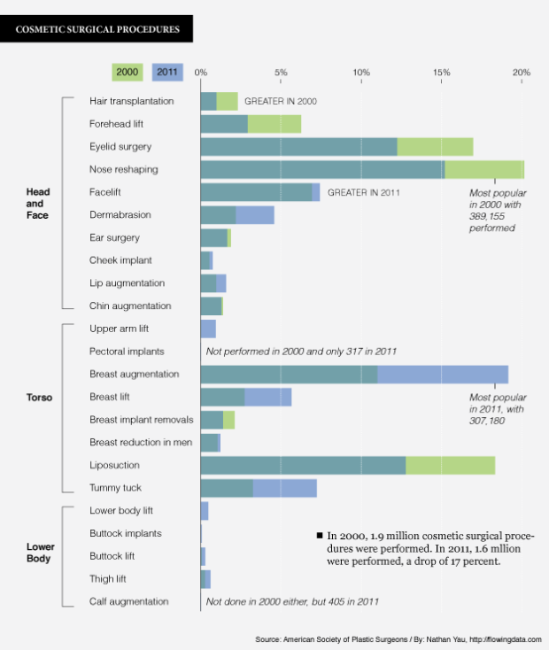
Many people aren’t happy with their face or body, and a proportion of those turn to plastic surgery to try to alleviate their displeasure. The American Society of Plastic Surgeons annual report shows just how many have opted for cosmetic surgical procedures. There were nearly 1.6 million of them performed in 2011, along with 12.2 million minimally-invasive procedures.
The above chart compares the distributions of the former from 2000 (shown in green) to 2011 (shown in blue). The two years are overlaid, and procedures are roughly organized by spot on the body. Breast augmentation led the way in 2011 with about 307,000 performed.


 Visualize This: The FlowingData Guide to Design, Visualization, and Statistics (2nd Edition)

The only not I would pick is the scale of the graph. The areas of the bars imply sizable shifts, but in absolute terms we’re only seeing differences of (mostly) 1 to 2.5%. Over ten years., that’s not really significant.
Pretty odd way to compare two series. My brain crashed. I fear old school side by side bars might have been more readable.
I find the graph confusing.
Very confusing. I immediately wondered where the third color was coming from.
I agree with the other commenters. It took me a while to work out that the third colour was a blend where the top colour changes depending on which year had more surgeries. Side-by-side would have been a lot easier to understand.
Welcome to my playground.
Your use of overlapping bars works for me; I can quickly grasp which of the years was greater. But, I think that the blend of the two colours would have been clearer if the overlap had been called out in the graphic. Or instead of a callout perhaps the use of different colours, e.g. red and blue overlapping for purple or yellow and blue for green, would have been a bit clearer.
I was thinking about using a pattern (e.g., dots) instead of a colour for one of the years so it’s more obvious that what you seeing is an overlap.
both good ideas
Another alternative to the overlapping bars is to use two partly overlapped bars. See an example in the lower parts of the graphics in this blogpost: http://aytm.com/blog/research-junction/ipad-3-infographic/ .