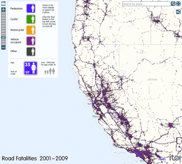
For The Guardian, ITO World maps about 370,000 road-related deaths from 2001 through 2009, according to the National Highway Traffic Safety Association. The map is kind of rough around the edges, but it gets the job done. Easily zoom in to the location of choice either by clicking buttons, or type in the area you want in the search box. Zoom in all the way, and you’ll notice each accident is represented by an icon indicating type of accident, the age of the person who died, and year of crash.
As you might expect, accidents are more concentrated at city centers and on highways. What I didn’t expect was all the pedestrians involved.
 Visualize This: The FlowingData Guide to Design, Visualization, and Statistics (2nd Edition)
What’s great (in a mapping/data kind of way) about this is that Sturgis, SD lights up immediately. A good mapping should allow people who are not familiar with the information to gain insight and lead them to ask further questions like “Why so my motorcycle deaths in an area of South Dakota.”
http://en.wikipedia.org/wiki/Sturgis_Motorcycle_Rally
Hopefully this mapping can produce a change in the way to commute.
Following on Kris’s observation, the analysis would be much more useful if it showed fatality rates, i.e., relative to some whole population. Sure, we expect more fatalities where there is more traffic. The compelling question is, how many fatalities per unit traffic (or whatever)?