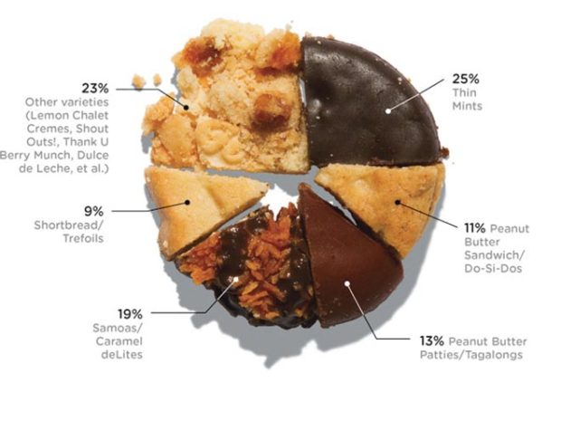
With Girl Scout cookie season around the corner, Wired pies it up with cookies showing percentage of sales. It’s all about the Caramel deLites. [Thanks, Elise]
Girl Scout cookie pie chart
FlowingData Delivered to Your Inbox
7 Comments
Second Edition
 Visualize This: The FlowingData Guide to Design, Visualization, and Statistics (2nd Edition)
 Visualize This: The FlowingData Guide to Design, Visualization, and Statistics (2nd Edition)
New tools, refined process.
Clearly it’s NOT all about the Caramel deLites, but the Thin Mints. :-)
It would also be interesting to see this scaled by the number of cookies: packages of Thin Mints have a whole lot more cookies than the Peanut Butter Patties.
+1 for pointing out the fact that thin mints trumps all other cookies! My favorite hands down. Stick ’em in the freezer and its like pure heaven on a hot summer’s evening.
Huh – that’s the first diagram in the McClave & Sincich Stats book.
Now! I am hungry…
i’m with @Gumnos, love the Thin Mints! just wish they sold ’em overseas…
Note the Peanut butter segment has 24%, which is right up there with thin mints, although requires more SKUs.
Makes you wonder why there is only on SKU here. Wouldn’t you think “thick mints” would do pretty well?
One failure with this study is that it fails to account for how every time I see girl scouts selling cookies the Thin Mints are out. I think the level of apparent Thin Mint demand is supressed by inadequate supply, and thus lower in this chart than it actually is.