Earlier this week we saw two versions of mobile patent lawsuits. The original was tangled, whereas the interactive revision was less jumbled. Reader Josh commented that the original had an advantage over the clearer version in that it actually demonstrated the mess that is patent law. A simliar argument came up last year, too, with this confusing chart showing Obamacare.
With the patent chart, there’s clearly a way to make the data more readable. If you had a choice between the original and the remake, is it okay to choose the original if your point is that mobile patent lawsuits suck and are more confusing than they need to be?
 Visualize This: The FlowingData Guide to Design, Visualization, and Statistics (2nd Edition)
If the intention of a communication is to impart a sense of confusion and complexity then a graphic that does this achieves the objective. It reminds me of the much discussed McChrystal presentation slide from last year http://www.guardian.co.uk/news/datablog/2010/apr/29/mcchrystal-afghanistan-powerpoint-slide – the purpose of using this slide, as I recall, was simply to demonstrate how complex the situation was in Afghanistan. In that sense it worked. What didn’t quite work out was the reaction of those who saw it in isolation, and therefore out of context, and used it as a stick to beat up PowerPoint, missing the point completely.
Hi Andy – we just made exactly the same point. Your comment wasn’t showing when I wrote my comment. Clearly great minds think alike…
Lets not get ahead of ourselves. All we know is that two people named Andy offered a similar post. At best we have a two data points for a correlation that Andy’s think alike.
Yes it is okay to confuse, if the point is to express the complexity of the argument. I’ve made this point before when referring to the US Army’s (in)famous powerpoint slide describing the situation in Afghanistan (http://www.guardian.co.uk/discussion/comment-permalink/4807922). Everyone lambasts it as a disastrous viz. But if the point is to clarify the complexity then it’s a very successful viz.
We seem to be in-sync this week Andy!
We have a similar issue with a map in an annual report I work on. It’s pretty cluttered with icons about our work, and sometimes people say “Oh, too much info.” Bu the whole point of the map is to say “We’re in lots of places” – so a little confusion is OK I think,
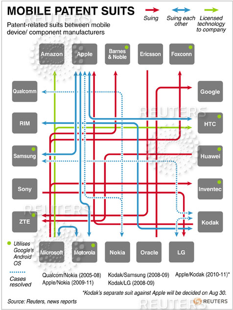
To show that something is confusing, that’s rhetorically OK because it might help making a point. But the next step is to suggest a solution for it, i.e. untangle it and show the clean version. Or pose the question if there are any ideas how to make it understandable. The chart on mobile paten lawsuits by Mike Bostock proves that complicated doesn’t necessarily mean confusing.
Communicating confusion and communicating something in a confusing way are different things. I think that the first chart is doing the latter.
If you want to communicate that something is confusing, a very powerful way to do it its by contrast, which in this particular case can be done showing both charts. The catch is that you need the simpler form to make the contrast evident.
You nailed it with the key point I was struggling to communicate: “Communicating confusion and communicating something in a confusing way are two different things.”
I think it depends entirely on whether the chart/graphic is specifically an illustration to quickly hit home a single or simple point of view, or more of a tool to enable true understanding of a subject.
I’d say that typically any communication written by a journalist would fall into the first bracket – they have to write for an inattentive and unknown audience. For a news story, a chart simply has to fulfil the same demands as a photo – communicate the gist as quickly and powerfully as possible.
The central point of this story is that the subject matter is a confusing mess, and the graphic conveys this confusion more intuitively and much quicker than the words would alone, plus grabbing attention to boot. Comprehension rate of the journalist’s position is up – success!
My boss, on the other hand, maybe isn’t so interested in my own personal opinion on a subject and has the time and inclination to fully understand a subject matter. A deliberately confusing chart would eventually serve only as a funky illustration to my P45 :-D
If the goal of visualizing data is “sense-making,” then the work of an analyst is to make visualizations that are as clear (and often as simple) as possible. To purposefully introduce confusion where it doesn’t need to be is essentially making a value judgment on the data being presented–something we would generally want end-users of the data to do on their own.
Bostock succeeds in creating a visualization that helps us make sense of the data and then allows us to draw our own conclusion. It would be difficult for anyone to draw a conclusion from the Thompson-Reuters graphic other than that our patent system is very broken.
Agreed. It is easy to lie with data visualization. “Lie” might be a strong word, but what else could you call it? What they did was take a tool designed to make complex information more manageable and use it for the exact opposite. People will assume that is the most understandable abstraction of the data, because they know what data visualization is for… in this case they would be wrong.
I would agree with James. The intent should be clarity. If after analyzing the data you are still confused and you create a confused graphic, then you have failed your task. If, the other hand, you are not confused and merely wish to make the story appear as confusing as possible, then you are misleading the audience.
If you can’t make the data more clear using a graphic, keep trying. Mike Bostock did and clearly his result is superior with the exact same data.
In order to convince somebody that a situation is messy, we should deliberately choose a visual representation that appears less comprehensible than other correct and easier-to-understand ones?
Not sure that can be an operating guideline, Andy (both of you).
When we read an article on an issue, we expect a good author to present all relevant facts in a manner that helps us arrive at a conclusion, which the author hopes is the same as his/her viewpoint.
The primary purpose of a visual is to help in better understanding of the facts. Whether the reader thinks the situation is messy or not should depend on the data/facts and not by impeding the understanding via the visual.
The above is IMHO.
Perhaps the suggested tip could be an advanced tactic for limited use.
In any situation except the very simplest (and then no graph is needed), you can create a confusing graph. So showing a confusing graph means nothing *if I know that you think it’s acceptable to creat confusing graphs on purpose*.
If you tried your best to make a clear graph, and you usually manage, and in this case it’s still confusing, then this conveys the message that the situation is complex.
Telling me you make confusing graphs on purpose sometimes tells me that I cannot trust your more complex graphs.
Looks too much like lying, and too easy to abuse, to me. I’m against.
I don’t find the original graphic aggravatingly confusing. It looks like a microchip and is about patent disputes between tech companies. Seems right.
Just an allegory:
I heard an NPR interview about the mobile patent wars yesterday. The correspondent was interviewing someone (another journalist, I think) who was describing the numbers involved and the back-and-forth matter of the war. The correspondent listened, then said (paraphrasing) ‘You know, I’m looking at this graphic about all this and can really see how confusing/complicated all this is.’ I knew instantly she was looking at the Rueters piece – and it popped in my mind’s eye. It made for vivid radio…
Not ok.
Saying “This is interesting” is, in itself, not interesting. Similarly, saying “This is complicated” doesn’t actually say anything.
However, I will say that this graphic has a more interesting message: Lots of large companies are suing each other over patents. The Obamacare graphic, in contrast, has no message other than that the person who designed it doesn’t want you to understand health care reform.
I don’t think one graphic is necessarily more “confusing” than the other.
Both graphics presume that the mere fact that one company is suing or has sued another company is of interest; that suing and being sued is more or less the same; that the nature of the resolution of a suit is irrelevant; and that licensing is more or less the same as suing (but licensing Android is not). The difference between the Thompson Reuters graphic and the Bostock graphic is the suggestion in the former that everyone is an equal participant, while the Bostock graphic shows this is not quite the case.
In my view, that is the problem of the Thompson Reuters graphic: it is misleading. If we are to believe that the mere fact that one company has sued another is of interest, shouldn’t we know that, say, Microsoft, Apple, and Kodak are parties in 22 of the 28 suits?
But I don’t think either illustrate the putative problem with the patent system. The mere fact that one company has sued another is not an issue; in any system of where one company has a right that another can infringe, such suits will happen. The problem is the cost to society of these suits. If judges were oracles and could divine a just resolution instantaneously, there would be no cost and there would be no problem. But they aren’t.
A better graphic might illustrate, say, how much more your phone cost because of the money the company had to pay its lawyers and its competitors for permission to develop it; how much longer your phone was in development because of delays dues to intellectual property disputes; or features your phone doesn’t have not because they are not technologically possible but because the company is not permitted to provide them.
the purpose of your product is dual: 1) any infographic should convey the data to its reader AND 2) the reader should make an opinion about it. if its confusing from the start, how can the audience make any conclusion? im sorry but the original graph really doesn’t work for me. =)
I agree with Andy (both Andies, actually) as i think it’s legit for a chart to demonstrate complexity and confusion.
however, I am not convinced that the reuters chart wanted to do that.
also, it’s common practice to design a chart so that one aspect of the data which would otherwise be salient is downplayed. For instance, “neglecting” to sort a bar chart by value, so less attention is devoted to the maximum and minimum categories. or, choosing a sampling frequency for a line chart that makes some short term variations completely invisible to the viewer.
Again I feel all of these strategies are fair. Charts are about presenting information, which supposes a subjective bias. A good chart is one that allows the author to share their interpretation with the viewers
I agree with a lot of this but I think situations where “confusion” should be communicated needs to be defined a little.
If the author of the graphic is confused and they wish to communicate this point about themselves, then presenting a confused chart, which represents the author’s confusion, would be a good idea.
Same thing if the author is communicating a conclusion about a particular audience. If you want to show that patent lawsuits confuse a population, say “Canadian’s” for example, presenting a graphic that accurately represents how Canadians view the situation is again a good thing. To do this you would require data about Canadians (i.e. you’d have to interview Canadians first to conclude that they are in fact confused).
In this example however, the graphic is about a particular situation. A situation in and of itself is not confusing, only particular subjects are confused by the situation. Using graphics we can add clarity, as Mike Bostock did. Mike Bostock’s contribution did not change the situation being analysed, he simply made the reader less confused about the situation.
Absolutely.
I think this wasn’t the charter’s goal anyway, but it delivers (by mere luck) the message: how innecesarily complex this thing on patents has become.