Mike Bostock visualizes mobile patent lawsuits, improving on a graphic from Thomson Reuters that wasn’t so good. Dashed lines are resolved suits and green ones are licenses to the company.
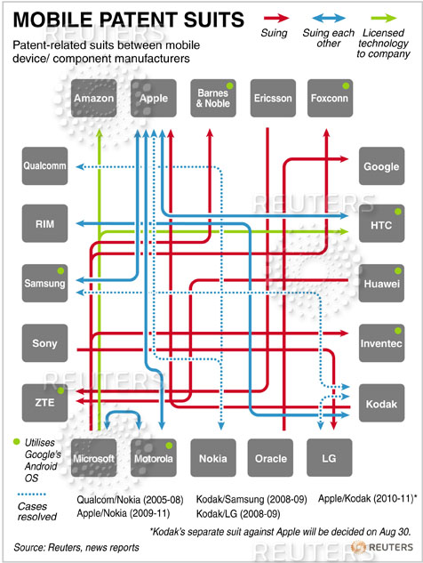
Thomson Reuters published a rather abysmal infographic showing the “bowl of spaghetti” that is current flurry of patent-related suits in the mobile communications industry. So, inspired by a comment by John Firebaugh, I remade the visualization to better convey the network. That company in the center? Yeah, it’s the world’s largest, so little wonder it has the most incoming suits.
Here’s the original, which is a mess of squigglies:

Bostock’s is way easier to read and interpret. There’s no criss-crossing, and placement actually means something. Interactive version here.
By the way, This American Life recently did a great episode on the whole mess that is patents and lawsuits. It’s interesting even if you’re not in to tech-related news.


 Visualize This: The FlowingData Guide to Design, Visualization, and Statistics (2nd Edition)

You know, there is one advantage to Thomson-Reuter’s infographic – it *looks* more complicated and tangled. When you’re trying to convey a particular slant on an issue (here, for instance, that the lawsuit situation is messy) you might sacrifice utility as a tool for understanding who’s suing who in exchange for increasing the “at a glance” communicative impact. The TR graphic is less useful for understanding the details, but may be more useful for grasping the overall situation – at least for the message slant that the patent suits are tangled.
The android information is missing (another node or just google) and also Motorola was bought by Google. Adding this information puts Google in the middle of the mess…
This version is better to read, but I don’t like the green arrows. They are not easily to distinguish from the black arrows, but symbolize something completely different.
The two green arrows are too close to special cases.
It’s interesting to see Kodak in the middle of suits and counter-suits, and Microsoft in a similar situation. Microsoft’s demise has been predicted as often as the second coming of Christ (and with as much accuracy), but it’s interesting to see it in graphical form.
The Guardian compared different charts addressing this topic (8 Oct 2010), and selected this as their favorite:
http://news.designlanguage.com/post/1252039209
I think there are still ways to improve it. The green does not stand out very much, and it is hard to distinguish between the types of lines. Even if you were able to, I think the arrow should be reversed as HTC is the one that is paying money to Microsoft.
To pack additional data, there would be two types of arrows – one for pending lawsuit, and other for resolved. In every resolved case, the arrow would be able to tell you whose favor it was resolved in. Also, it would be helpful if the clusters were marked in someway, such as Hardware Vendors, OS Vendors and such..
There have been several attempts to visualize the mobile patents mess – I’ve collected them here. Mike’s does stand out as one of the best efforts. Adding an Android flag should be fairly easy to accommodate. The recent acquisition of Motorola by Google does change the landscape somewhat.