The two differ in who uses them, how they are used, and who consumes them. They have the same goal. It’s to better understand data. You’d think that common bond would draw statisticians and information visualization researchers together for ample collaboration, but that isn’t the case. You see, each group doesn’t quite understand what the other is doing, and that’s where intermingling gets tricky.
In the most recent Statistical Computing and Graphics newsletter [pdf], two short articles — one from a computer science point of view and the other from statistics — contrast statistical graphics and information visualization, respectively.
In the former, Robert Kosara argues the usefulness of InfoVis, namely it’s not just pretty pictures and static graphics. InfoVis promotes exploration:
And yet, visualization is much, much more than what it appears to be at first glance. The real power of visualization goes beyond visual representation and basic perception. Real visualization means interaction, analysis, and a human in the loop who gains insight. Real visualization is a dynamic process, not a static image. Real visualization does not puzzle, it informs.
In the latter, Andrew Gelman and Antony Unwin argue the benefits of traditional statistical graphics:
In statistical graphics we aim for transparency, to display the data points (or derived quantities such as parameter estimates and standard errors) as directly as possible without decoration or embellishment. As indicated by our remarks above, we tend to think of a graph as an improved version of a table. The good thing about this approach is it keeps us close to the data.
Wait. Those sound kind of similar. Both articles, written independently of the other, discuss different approaches to visualizing data, but they have similar sentiments.
Oh, but the difference. There has to be a difference.
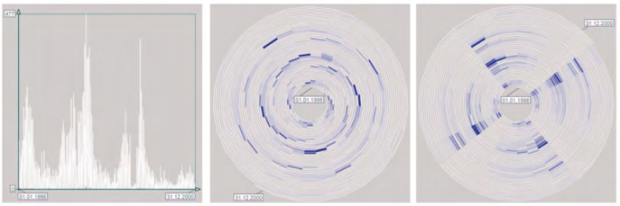
Kosara uses a spiral example (above) as interaction with data. It shows periodicity.
You can try an interactive version here. I’m still on the fence on the spiral’s usefulness, but it has its merits.
Gelman, despite always starting and ending his critiques with a desire to collaborate and learn, said it demonstrates the “Chris Rock effect: a pleasurable intellectual effort spent in discovering something obvious that could’ve been noticed (and even quantified) much more easily and directly via a simple dot and line plot.”
A series of maps from the MIT SENSEable City Lab is another example that Gelman says demonstrates the effect. It shows community clustering based on message rather than state and county borders.

However, as stat researcher Chris Volinsky notes:
The top graphic is really quite nice. (Disclaimer: colleagues of mine at AT&T worked on this but I actually do like it). The fact that calling patterns follow state boundaries in some places but not others is quite interesting and unexpected.
Chris Rock is hilarious, but in this sort of discussion, there’s no way to take that but badly. Kosara responded:
That is clearly not what information visualization is about. The problem is not that Gelman misrepresents infovis on purpose, he simply has a skewed picture of what it is.
Truth be told.
This is true of most statisticians I’ve met and is obvious in Gelman’s focus on infovis and aesthetics in follow-up posts. I think he sees the bulk of infovis as beautifying graphics, making data stories more colorful, and drawing in readers. Gelman clumps infographics that hit the front page of Reddit or go viral on Facebook (such as this) with serious information visualization (such as this). However, Kosara isn’t a fan of the former either. It’s why he organized (and I tagged along) a workshop at VisWeek to encourage visualization researchers to publish their work online. On FlowingData, sometimes I post graphics just because they amuse me, and other times I post them because they’re really good work.
From the research side, infovis is about perception, finding what visualization methods work best, and how to make large datasets more approachable and easier to explore.
From the application side, you don’t have to look farther than The New York Times. Their graphics and interactives are nice to look that, but the beauty is just a side effect of thoughtful research, design, and journalism.
On the flip side, infovis researchers also have a skewed picture of what statistics is. Most statisticians’ work is not seen. It’s in models, R scripts, more models, and analytical reports. So graphically speaking, an outsider looking in will see a lot of raw plots generated in R. They were useful to the one who made them, but not to a general audience, and the graphics most likely supplemented a more rigorous analysis. Statisticians like to quantify things more than they like to visualize them.
So again, while statisticians and infovis researchers tackle the same problems, they approach these problems very differently. They’re looking for the same trends, patterns, outliers, and correlations, but explanations and representations often don’t sound or look the same.
To work together, the two have to speak the other’s language, and yes, we can all stand to learn a thing or two from the other. Not just making things pretty, but more usable and interactive; and not just hypothesis testing and regression, but a more analytically rigorous approach to data. From a non-academic, in-practice perspective, statistical graphics and information visualization actually aren’t all that different. Getting along shouldn’t be this hard.
 Visualize This: The FlowingData Guide to Design, Visualization, and Statistics (2nd Edition)
I have been following this debate for a while and at this point I am wondering if we are debating over a non-issue. In my opinion there is no difference between any area of visualization, we should actually call everything visualization and recognize that the only difference is between good and bad ones.
I find this all discussion somewhat pointless at this point especially because here we are discussing the view of Gelman vs. Kosara assuming this is the view of two whole factions. And I think this is simply not true. Lots of statisticians have been in the infovis community from the very beginning (e.g., Leland Wilkinson) and they contributed to its shaping a lot. Plus, people in infovis have been for a long time trained with the texts produced by statisticians (Tufte, Cleveland, etc.). Interestingly, the same parallel and criticism can be done with Geographers. But again they built the foundations of infovis and every serious professional in the filed would recognize it.
So, what are we debating over here? It’s clear from what Gelman says that he just doesn’t know what infovis is. He is calling infovis things that are bad or not so great examples of infovis. Visualization is one single field of investigation with a common theoretical foundation, there’s nothing like a Statistical Graphics vs. Information Visualization. The sooner we realize that the better.
In terms of the goal, there is really no real divide to find between Infovis and StatGraphics. Both sides seek a good/perfect graphical representation of some kind of data, which tells the story behind the data most effectively.
But there is certainly a big difference regarding how the two communities go about reaching this goal. In short, the InfoVis community usually relies on managing the technical issues of creating the visualization most effectively, whereas statisticians (if they use graphics at all) think of the properties of the data more deeply. The fact that they usually come up with quite different results make me quite confident, that there is still a lot to learn from “the other side”.
i think this debate is a bit of a bore. People should focus on making useful things, rather than wasting time throwing stones.
On that, Nathan, i think your book is great. You have done something useful, and i for one am pleased you invested your time in that book, and am well satisfied with the value i got for my money.
i’ve gone from zero to using Python and R to make an interesting chart-set in no time (including scraping data from the web).
my first effort is here: http://ricardianambivalence.wordpress.com/2011/08/17/visualising-city-to-surf-2011/
Hi Nathan,
excellent post. I’d like to add one thought.
Looking at Ricardo’s comment above, it is easy to find another aspect that really separates InfoVis and StatGraphics people – the tools and techniques we use.
The InfoVis person will usually be technically very skilled in sucking data from the web, deploying some visualization toolkit and presenting his/her stuff on a fancy website. Looking at the typical math/statistics trained StatGraphics person, we usually can be quite sure that he/she will not be able to succeed in only one of the steps. Thus, as you already mentioned, much of the StatGraphics work will stay “in the dark” and vice versa, much of the InfoVis work (which should better stay in the dark) is presented to a broader community.
I see the biggest challenge in constructively criticizing the “low quality” InfoVis work that too easily gets much attention on the web. This is something that must come out of both communities. I am sure this can happen as most of the people in InfoVis I know, pretty much can distinguish between chart junk and well thought graphics.
Btw, statisticians publish at least as many bad graphs as InfoVis people do, but they rarely reach the public and thus cannot make much damage outside the poor students who are forced to read these papers …