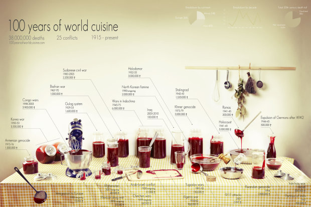
Rather than bars, bubbles, and dots, Clara Kayser-Bril, Nicolas Kayser-Bril, and Marion Kotlarski use jars, bottles, and bowls of fake blood to show deaths from 25 major conflicts in 100 years of world cuisine.
Ten casualties. Ten million casualties. Our understanding of conflicts is often nothing more than a handful of digits, the more precise, the less meaningful. The anchor’s tone remains the same when talking about major wars or isolated outbursts of violence. The horror lays hidden beneath the rigidity of numbers. Figures give us knowledge, not meaning.
We wanted to put a picture on these digits. A shocking, gory picture, like the reality of war. We wanted to give context, like a scale on which we could visualize each conflict next to the others.
The idea is straightforward. More blood = more deaths during the corresponding conflict. What do you think—does the medium make the data more meaningful?
The graphic is also available in print.
 Visualize This: The FlowingData Guide to Design, Visualization, and Statistics (2nd Edition)
This infographic is definitely not understandable, and almost all the writings are hard to be read.
The visualization with blood, while is likely respecting the real data, is not appreciable with a glance of the eye, mostly because the auctor changed the shapes containing the liquid.
Beside of this, the blood representation is funny but it winks with a very strong mood to a cultural usage, which is disrespectful toward the reader.
In a word, it’s the worst infographic piece I’ve seen since January.
Let’s have a look at the Alberto Cairo’s legacy
Doesn’t work graphically, though it’s a really good idea. One problem is that the largest number of deaths is attributed to the holocaust, but the blood for that event is in an opaque bowl, so it looks less dramatic than the Algerian war.
Another problem is that the relative measurement is three-dimensional, but the image is two-dimensional. So a blood-coated ladle representing 9/11’s 3,000 deaths is visually equal to the beaker representing Afghanistan’s 40,000 deaths.
Also, the omission of WWI (9.7M military deaths, 6.8M civilian deaths) and WWII outside the holocaust (60 million deaths) is a bit boneheaded.
Interesting graphical depiction, hard to grasp.
The number of jews killed in the NAZI holocaust is much closer to 6 million than to 5 million. Many suspect it went upwards of 7 million, but this has not been proven. So, you have a wrong number in the calculations. That blood bowl needs to be a little larger here. Please take caution against revisionist history.
It is also important to note that several million non-Jews were also killed in the Holocaust
The figures I commonly see are 6 million Jews and 6 million others — blacks, gays, Gypsies, and a whole bunch of other wholly undeserving folks.
So that’s understating the deaths by 7/12, or roughly three-fifths.
It’s also not real clear where the line is drawn. The Armenian genocide and Holocaust were at least in part internal purges, so you need to include the 18 to 24 million folks Stalin killed. And then there’s the Khmer Rouge and Pol Pot and all sorts of other nasty, awful things not reflected in here.
I don’t understand why immigration to Europe is included among all these wars. And representing it as ladleful of blood is a nasty thing to do – it looks like neo-nazi propaganda. Probably not intentional, but it doesn’t reflect well on the authors’ common sense.
The graph does not aim to give an exhaustive lists of wars.
It takes inspiration from a food recipe type representation of data, in which also does not aim to give an exhaustive list of good.
If the reader starts from top to left, which is a common way of reading maps or graphs, it starts by saying 38 mill deaths and 25 conflicts
And lastly, in reference to Dave, the immigration to Europe most likely refers to individuals perishing, in particular crossing the Mediterranean, The migration is made so difficult by European governments many die under way. So if anything it is a criticism aimed at neo-nazis.
It might be a bad graph for impatient web-surfers – but the aim of this graph – I believe – is very much qualitative rather than quantitative.
Thanks Michael! You answered the comments way better than I’d have.
Nicolas Kayser-Bril (author of the pict).
I like the idea but my issue is that if you are going to compare “conflict dead” across the last 100 years you have to include WWII. You can’t ignore the single most important conflict in the history of the world in something like this.
Not to include *the* central point of reference when talking about the tragedy of war fundamentally undermines the message of this graphic. It’s intended to educate, to hit home, but without WWII represented the viewer can’t come away with a balanced qualitative impression.
To leave it out suggests that the authors don’t actually really care that much about the subject, and believe a pretty array of bloody containers is more important than conveying a full message
I’m not sure it works. The imagery is almost kind of pretty, in fact.
While reading the numbers and meditating over what they mean somewhat mollifies this, we’re talking about a lot of mouldering corpses. History, of course, is loaded with masses of mouldering corpses. Would I use images of mouldering corpses? Not necessarily. Maybe add a nicely framed print of Goya’s “Saturn Devouring..” (http://en.wikipedia.org/wiki/Saturn_Devouring_His_Son) hanging on the wall? Too stark? Something…
Quasi-ditto on prior comments, but, to help understand the relative *magnitude* of these different conflicts (as measured by total deaths), a horizontal bar chart would really do the trick much, much more effectively. Aside from the differing container shapes, we don’t do well with 2-dimensional area comparisons (pie charts), much less 3-dimensional.
Using a blood color (or, heck, even using stick figures next to each other to make the “bars” where each figure was 10,000 deaths or something) would be fine. But, to “bring it home,” I would add a couple of non-war mortality bars into the mix — number of deaths in the U.S. from breast cancer in the last 10 years, number of deaths from some historical epidemic (although some of them may dwarf wars), etc.
Sometimes, intentionally making something just quiet enough to hear or just hard enough to see makes the viewer strain to observe. I am not asserting that was the intention of the creator, but I found myself spending the extra effort to read the event, time, death count because of the power of the information.
Additionally, while not bar charts or easily comparable, the containers along the back are similar.
Another example of the fine line between clever and stupid….
Quantitatively it fails for all of the reasons above: largest events are obscured, volume vs. area, etc.
Qualitatively it fails since this is in no means the “shocking, gory” picture the authors hoped for. It has no visceral, horrifying effect at all. In fact, it just looks like Iron Chef: Tomato Juice. Would anyone look at this image unprompted and think it was blood?
in short: good idea, poor execution.
@Chris – Calling it 100 years of cuisine doesn’t help either, unintentionally making light of the subject when they were trying to do the opposite.
And where is Mao’s killing of 60-70 million Chinese? But that is the least of the problems with this chart.
Ditto all of the above, and they used the Iraq figure which has been proven wrong many times.
Agree with other commenter’s here. I would take a look at including other wars and maybe excluding some (European Immigration?)…also, including deaths caused by non-wars (like another commenter suggested) such as the black plague, AIDS, cancer, etc. perhaps on a different table , may give more meaning to the viz. Lastly, if the jars on the table were arranged left to right by time, it may have been more effective. Definitely more of a work of art than an effective viz. Kudos on the creativity.
I’d admit some lack of precision in the data (or in the way of displaying the data) in favor of some “poetry”. I don’t think is the case of this graphic (it’s a good idea, but it doesn’t work in many ways), but I like to think that infographics and charts can communicate in other ways than displaying data. We only have to be careful.
The message of this Infographic is: “The next time I will cook something, I will remember that there have been many wars in the World”
If it makes a boring bar chart, you don’t just gloss everything over and confound it all with “art”. That does not make it more poignant, it makes it hard to reach and inaccurate.
Worst parts: lack of WWII (how is it possible to miss that?), complete lack of respect for the fact that the “blood” they are depicting are actual humans.
Ross,
Last time I looked, the Holocaust, Stalingrad and the expulsion of Germans from Eastern Europe were all part of WW2. It seems interesting to me that a single battle – Stalingrad – killed as many people as some of the major conflicts of our times (Rwanda, for instance) and that often overlooked events (the expulsion of Germans) was way more lethal than any non-African conflict since the 1990’s.
If your purpose is to put tragedies into perspective, as you suggest with your comment here, you can’t just cherry-pick from the WWII period. The whole conflict is THE point of reference for Western culture. There are 53 million more dead you left out, just from those 6 years, which is significantly more than the whole of your table there.
Whatever artistic challenge it is that you have to overcome to portray WWII within this artwork – one big barrel? several small barrels? – it is a challenge you have to overcome, otherwise the whole thing becomes more like ignorant and ghoulish pop art
An example of how visualization can be used for disinformation. Some numbers in this visualization are deliberately wrong rather than lacking precision..
YYYYYYYYYmmmmmmmmmmmmm to comment or not to comment… Okay death is cool as long as you dont have commit suicide or driven to do so. Feeling of not able to do things you want to do… is way above in millions and billions …. it is worse than any death … death is momentus ( in moments ) a stupid life is a life sucker.. I look around getting… a bit to travel if one calculates the total number of people who truly have good meal and a bed it is 600 million tops …. 90+ % are living dead………….)))))) Welcome home this is Planet earth…