Stats of the Union, the new Fathom-produced iPad app, maps the status of health in America. Browse, pan, zoom, and explore through a number of demographics and breakdowns.
Stats of the Union is powered by the Community Health Status Indicators (CHSI) report from 2009, which consists of data from federal agencies including the Census Bureau, Department of Health & Human Services, Department of Labor and the Environmental Protection Agency.
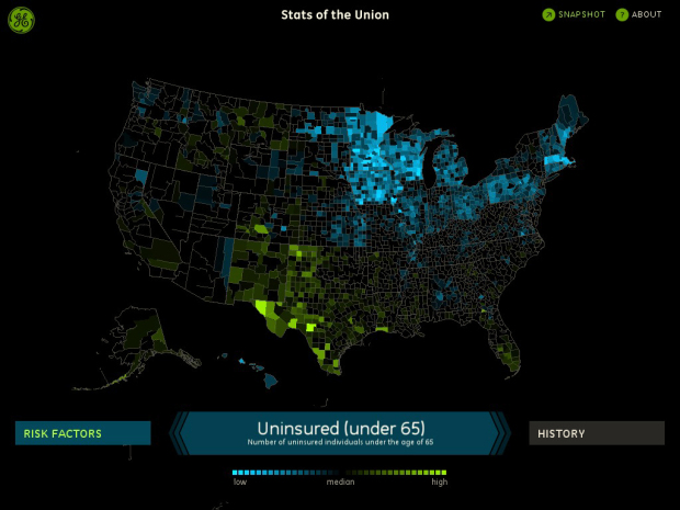
With all this data you can look at population, risk factors and indicators of health. Zoom in to get the specific data for a county. Zoom out and compare your county to an overview for each state or for the whole country.
Unfortunately, I don’t have an iPad, so I don’t actually know how good it is, but it looks great from the video below. I might have to hijack someone else’s iPad to I can start playing with all of these data-ish apps coming out. Update: I hijacked my mom’s iPad like a good son over Mother’s Day weekend and installed the app. Worth the free download.
 Visualize This: The FlowingData Guide to Design, Visualization, and Statistics (2nd Edition)
I like the concept and the app is pretty good, with one defect: they aren’t consistent with their colors!
On one map, blue was high and green was low, and on the next map, green was high and blue was low! Why?!
I also was left wanting a number scale underneath the color scale. I’m not sure why they left that out.
That color thing is confusing, but somewhat unavoidable with such a range of data: eg low and high are not consistent. I like the app, great to access to so many stats in one format.
One of the first iPad visualization apps I’ve seen, so I’m glad about that. But the colors are completely non-intuitive, making the app nearly unusable. Neither green nor blue is obviously “high” and when the colors keep switching for each new stat, it forces you to constantly look at the legend and make a context-switch on what the colors mean. And the lack of numbers on the legend mean you have no clue what the data actually means.
The use of median rather than mean as the center point on the color scale is interesting, but it would be useful to be able to switch this to see what the maps look like when centered around the average. Many of the stats would be better represented using a color scheme that allowed for continuous magnitude comparisons instead of comparing against a midpoint.
Then there are the bugs. Rendering brakes down when you zoom in with some county lines failing to be drawn and the overview map gets obscured by the zoomed map when panning.
Overall, an okay first attempt, but it feels rushed. And considering it was created by Fathom, Ben Fry’s group, it’s a bit disappointing.
A little bit of background on their choice of color: http://fathom.info/latest/466
Their post on how they arrived at their colors makes them look worse, rather than better. It shows a complete lack of understanding in how to use color on heat maps. It appears they didn’t explore any of the “standard” heat map color schemes like red-black-green, blue-white-red or a density rainbow scheme (which I think has problems, but at least is in common use). Again, fine with most groups, but I would have expected something better from Fathom.
Since I can’t post on their blog, I’ll link from here to an article on our blog about color schemes to use with heat maps:
http://blog.labescape.com/posts/tutorials/5-ways-to-use-color.html
This article don’t tackle why a single gradient is almost always a bad idea, but gives a couple color schemes to consider (using the ones from our heat map product, but Panopticon and others use similar color schemes).
But again, I don’t want to rail on the choice of color as much as the entire implementation. The color scheme they chose would be usable if they used it consistently throughout the app, and more usable still if their legend told you what the colors actually meant. Switching the meaning of the colors from stat to stat is the worst thing they could have done, especially when using colors that have no inherent psychological meaning (when green = good and red = bad, colors can swapped more easily).
Those are choropleth maps, not heatmaps. But, yes, the choice of which color ramp to use shows a lack of understanding concerning GIS and maps. However, the visualization is outstanding!
Another masterful piece!!! Congratulations! Is it possible to add time dimension to county data?