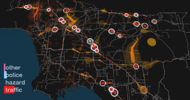
Los Angeles has a lot of things to do. The trouble is, compared to a city like San Francisco, everything is spaced out and you have to drive almost everywhere you go. There’s also a ton of people and therefore, lots of cars on the freeway. Waze, in collaboration with Gray Area Foundation and Nik Hanselmann, visualize 24 hours of traffic in Los Angeles, a subject that holds a bitter spot in my heart.
It starts at 5pm, right in the middle of rush hour, slows down in the late hours, and then of course picks up again around 7am, as people commute to work. Red dots indicate high levels of traffic and green dots indicate hazards, which I assume are accidents. Watch the day unfold in the video below.
[Video Link | Thanks, Michal]


 Visualize This: The FlowingData Guide to Design, Visualization, and Statistics (2nd Edition)

Very pretty. Although I’m not sure what I’m seeing, except that there is alot of it, especially during rush hour.
What does it mean when a road segment ‘flashes’ turns from regular white to bright white? My guess is that those indicate the travel path of a Waze-enabled vehicle.
What do the red and orange clouds mean, and why are they different widths? Perhaps those indicate traffic density?
I’ve been stuck in a major traffic jam at 3:30AM on the 405 in the middle of the week. It just doesn’t stop ;)
I feel your pain.
I’m sure I could find some of my answers at http://www.waze.com/blog/waze-presents-a-la-traffic-story/ .
Hazards can also be objects on the road, loose animals, water puddles, etc. On the other hand, I disagree with the convention that you need to drive everywhere in LA. The public transport system is pretty good unless you want to go to the suburbs, with a 24h bus system and a fast, cheap subway that takes you to most interesting places. It could be better, but it’s pretty good already. I would recommend visiting without a car. This guy at the NY Times tried it and loved it: http://travel.nytimes.com/2010/11/14/travel/14losangeles.html
Pretty cool, but isn’t this just showing us what we all already know?
Urban planning? Someday, someone with a room temperature IQ will solve this problem.
As a music video, it’s pretty cool.
As data visualization, there are a few problems:
-What are the flashing white lines?
-Why are surface streets and interstates given equal weight?
-Why do some lines flare up as red or orange at times?
Too much confusion. So, as a stand-alone data visualization, it doesn’t really succeed. Otherwise, I, as an Angeleno, could send this to my mom so she finally understands just how bad the traffic problem here is…..
Love the beat, though.