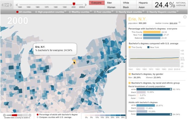
The Chronicle of Higher Education lets you explore the percentage of adults with college degrees from 1940 up to present, by county. Press play and watch the national average go up from 4.6 percent to 27.5, or select a county for breakdowns and a time series.
The strength of the interactive graphic is in the filters. They let readers zoom in on the group they’re most interested in. Narrow down by a variety of demographics such as gender or race, as well as select only counties that match criteria such as high population or wealthy.
There are some caveats with how Census has tracked educational attainment over the years (pre-1990 Census only asked number of college years completed rather than degree type) and changes in how people have been asked their race and ethnicity, but overall, the the graphic is pretty good.
[Chronicle | Thanks, Ron]
 Visualize This: The FlowingData Guide to Design, Visualization, and Statistics (2nd Edition)