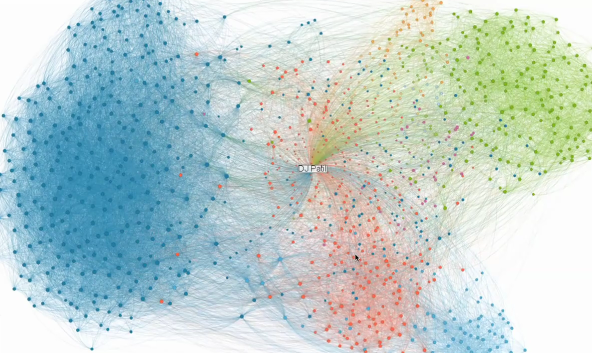
LinkedIn has been having some fun with their data lately. They opened up the career tree a couple of months ago, and today they announced InMap to visualize your links as a network diagram. They call it InMap:
InMaps is an interactive visual representation of your professional universe that answers all of the above questions. It’s a great way to understand the relationships between you and your entire set of LinkedIn connections. With it you can better leverage your professional network to help pass along job opportunities, seek professional advice, gather insights, and more.
Below is LinkedIn’s chief scientist DJ Patil with a brief description of how it works.
Basically, nodes are color-coded by groups you’ve affiliated yourself with, and placement is based on how you and the people in those groups connect. Bigger nodes represent people who are more connected in the group. Zoom in for more detail, and pan to see what you want.
I don’t think anything fancy is going on here, but it’s interesting simply because you get to see your network, and it’s up to you to decide what each cluster means. Update: Read DJ Patil’s comment on challenges with scaling for such a big network.
Here’s my LinkedIn network visualized. I don’t have a ton of connections on the site, so my view is sort of lame, but there are some meaningful clusters in there. The green one is the research center that I worked with, while the orange are people I’ve sort of worked with. Then the three maroon-colored nodes are friends. The rest is hit or miss.

How does your network look? Let us know how it works for you in the comments.
[LinkedIn via @steveeichert]

It worked well for me, off of approximately 200 connections (http://nemejo.tumblr.com/). Each colored group was a collection of folks that were easy to identify…not surprising, since each new job has lead to a group of interconnected coworkers. What was interesting to me was that two of the groups were split into sub-groups, and looking back it was because I spanned to separate areas (usually a local team and a national team).
As I mentioned on Tumblr. What I would really love to see is this sort of mapping done across networks. It is one thing to see the connections between my business contacts, it is another altogether to see how I segment my networks (business, friends, creative, etc) and to identify those who cross the boundaries.
Lastly, this is the sort of thing that should really be animated over time. This network formed in bursts and some of the groupings remained tight, but others spread out quickly.
Gary
Very fun! My graduate school classmates professors segregated into two nodes: those with offices on the 7th floor, and those working in labs on the 1st floor. I had an office on the 7th floor, but my group did field work, so we had a small lab on the 1st floor for equipment storage and maintenance. Interesting!
It’s a very good tool – and the first visualisations I have seen for LinkedIn. There have been many ways to hook in to FB and Twitter before this. I’ve now sat with a few people looking at their results – and the colour grouping is working well (although nowhere near 100%). Unfortunately, InMaps only gives part of the picture of your Personal Network. I think I am similar to you, Nathan, in not having a high percentage of my PN in LinkedIn. I “audited” it recently and LI accounted for only 11% – and 71% of these were weak ties. I’ve done a post on this at http://wp.me/pYnfH-78
I’ve been using LinkedIn for a while so it was fascinating to explore my map. What I found were three overlapping clusters showing how tight the my connections from Silicon Valley, Yahoo, and Six Apart overlap, then a very distinct group representing my colleagues that work at Dow Jones and then finally my most recent employer, Nokia has connections scattered in between as they kind of straddle both worlds.
Probably a total coincidence as I look at it now but all the Silicon Valley friends are on the left (West coast) while all my Dow Jones friends show up right around where you’d expect New England to be.
http://everwas.com/2011/01/more-linkedin-visualizations.html
really enjoyed this app! I believe there is much more data to explore from within LinkedIn.
Last year I did a project on mapping my LinkedIn connections, hope LinkedIn will pick up on improving that some day….
One thing that we should note about the calculation is that this only uses the “graph” of connections. We don’t use any other information. I think that is one of the very powerful aspects of this visualization. For example, in my case, it identifies my wife’s networks, students, people I went to grad school with, etc. Additionally there are a couple of reasons why this was a challenge. A) Getting everything to work in the browser in a smooth way from small networks (come on Nathan you need to add some connections :-)) to larger networks. B) The ability to “process” as many user’s networks as they use the site. There are over 85M users and that requires some serious processing power. We’ll do a more extensive write up when we can and I can say I was surprised by how much compute power we had to apply to make this real.
Hi DJ – firstly, thanks for building such a great feature! It is interesting that you have just create a graph of connections. I assume that you tried several different ways (e.g. geographical/workplace/college similarities). Sure that method is a challenge with the disparate standards of data entry among LI users? The connections method is really smart – as it essentially uses the FOAF info you have access to. In my network, it had, for one small group (Vistage/TEC International – where I used to be a member), accurately clumped these guys together in one corner. It had also positioned one of my key contacts between two groups (I’ve increasingly used the term “worlds”) where we both live/work/operate. Great work, has given me much food for thought in my research on Personal Networks. – thanks again.
One other thought, DJ. Please could we have a “Print to A0 Paper” service – so we can have our networks displayed as big as yours in this vid? http://wp.me/pYnfH-7f
@DJ – Working on it :). Grad student hermits don’t get out much.
If you get a chance, take a look at my blog for a video of DJ Patil (LinkedIn’s Chief Scientist – and project leader on InMap) talking through his InMap network. He also goes through a couple of other examples on a sheet of A0 paper – much easier than my MacBook screen. It’s amazing how a very large piece of paper makes visualisations even better (more understandable) http://wp.me/pYnfH-7f
It was interesting for me to see the groups I have been a member of and how they exist in generally separate worlds. My MBA classmates from different schools and even different years at different schools show up as separate clusters.
http://inmaps.linkedinlabs.com/share/Chris_Pounds/74039131172006572958860631458364501590
http://inmaps.linkedinlabs.com/share/Rob_Alexander/293999787040370491222757729541091077616
The network visualizations are stunning. Mine is in four main clusters: school connections, plus those from three jobs. Check it out: http://www.storytellingwithdata.com/2011/01/visualize-your-linkedin-network.html
BTW, does anyone know how I can change the pic associated with my comments? (The one in the apron is slightly embarrassing!)
http://gravatar.com/
Sorry if it’s a silly question, but shouldn’t the map update if new connections are added? I’ve added several new connections since first viewing my map and I don’t see them included… is there a way to force a refresh or something?
Thanks!
I did read somewhere that the InMaps would be updated every seven days – but not dynamically every time you add a contact. I think this is down to the issue DJ Patil mentioned earlier in the comments about “processing” for the 80m+ users. Hope that helps.
Okay, got it. I’ll wait another day or two and see. Thanks!
Mine hasn’t refreshed in well over a week …