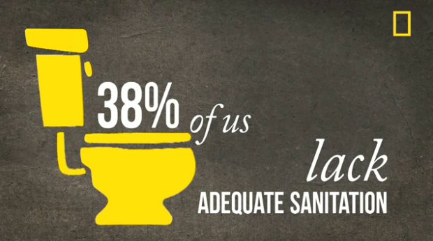
National Geographic argues a need for balance across the world population in the latest motion graphic video. As is usually the case with these, the video hits you with a lot of aggregate percentages and averages, but it’s well-produced and good enough to make you care.
Catch the photo slide show from Randy Olson, too.
[National Geographic via Kelso Cartography | Thanks, David]


 Visualize This: The FlowingData Guide to Design, Visualization, and Statistics (2nd Edition)

Pingback: The Visual Du Jour – It’s Crowded | The Global Sociology Blog
I wonder how many of us, 7 billion, know that are among 7 billion.
Pingback: 70億人時代(7 Billion) : monogocoro ものごころ
That’s just (nicely) animated text. Not graphics.
What kind of software is used to create a video like this?
Nice video.. yeah, what tool was used to implement this video?
I’d say Adobe Illustrator for some of the graphics work and Adobe After Effects for the motion. By how standards go, that would be my guess.
Pingback: World Population by the Numbers « Dynamic Data Display
Pingback: 1/10 FTP: Reactions to AZ Shooting, “Internet ID” Proposals, Lockhart’s First Overreach as House Speaker | KVNUFTP
Pingback: DataVis Preproduction: my scrobbles, let me show you them. « UCD Science Visualization Projects