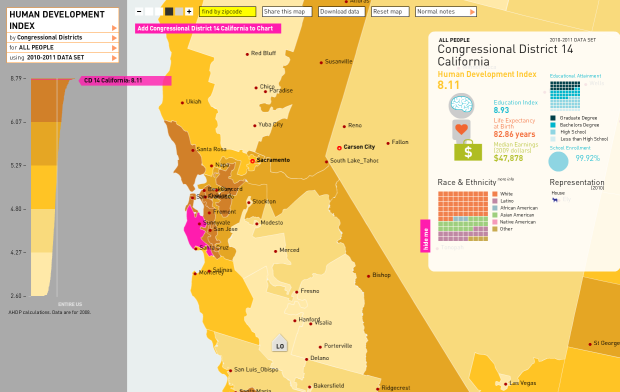
In work with the American Human Development Project, Rosten Woo and Zachary Watson map the Human Development Index, along with many other indicators in this thorough interactive.
Ever wondered how your state or congressional district stacks up compared with your neighbors on life expectancy, preschool enrollment, earnings or dozens of other indicators? Create customized maps by state and congressional district and by county for Louisiana and Mississippi. Build and sort data charts for over 100 indicators.
Basically, the Human Development Index takes four indicators into account and scales them to make a single score from 1 to 10:
- A long and health life (life expectancy)
- Access to knowledge (educational degree attainment and school enrollment)
- A decent standard of living (median earnings)
Browse the map by state or zip code, plus a panel of indicators as you select each region. The brain, heart, and money bag grow and shrink accordingly.
Or see indicators via a list view, which like the map, lets you select a whole bunch of different indicators.

The state with the highest HDI? Massachusetts Connecticut. The state with lowest? West Virginia.
[Measure of America | Thanks, Sha]
 Visualize This: The FlowingData Guide to Design, Visualization, and Statistics (2nd Edition)