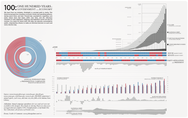
John Palmer has a look at the past 100 years of government and economic indicators:
This historical perspective visualizes economic trends and spending patterns, during good times and bad. Present-day assumptions regarding core party values have had major shifts over time, and the ridiculous extremes in voter alignment, lobbying, and legislative action are due for revision. As a basis for future shift, this data can educate a presumptive public, empowering citizens to make an informed decision on each and every election day.
I’m not so sure this would help you make a better informed decision as you vote, since the relationship between political party and economy is more complex than true and false. It’s a good historical reference though.
What do you think of the graph overlays on top for GDP, debt, collections and CPI, with different vertical scales?
[Thanks, John]
 Visualize This: The FlowingData Guide to Design, Visualization, and Statistics (2nd Edition)
Nice presentation but it’s a little confusing using different bases for GDP, national debt and tax. Why not measure all three in billions (or even trillions). And yeah, the different vertical scales are misleading.
Somewhat attractive visually, but I stared at it for five minutes and couldn’t make heads or tails of it. The chart tries to pack in too many facts, and ends up conveying very little information. All I really noticed is that unemployment was very high in the 1930s; the “blues” have held the Senate and the House most of the time since then, while the presidency seems to have traded hands more often. Andrew Gelman’s “Red State, Blue State” is one of my favorite books, so I know which color stands for which party, but would a young person, or someone from another country know that? I don’t see a legend anywhere. Perhaps I missed it in all the excitement.
The racetrack chart of spending in presidential elections is a total loss. I think my horse threw a shoe trying to figure that one out.
Hindsight in this case seems to be a prompt path to confusion.
I have to agree with the other commenters…it’s pretty and holds the promise of being interesting, but large swaths of it are a loss.
The chart “works” for party affiliations, unemployment rate, inflation rate and the horizontal tornado chart of debt vs tax income. It’s a complete loss in other areas, especially the racetrack chart and the competing scales for GDP, debt, tax income and consumer price index. I found the voter turnout to be inexplicable until I’d looked closely at the legends, and then the optical illusions generated by the overlaid bars made it merely confusing (e.g. total voter turnout appears to have dropped, but this turns out to be largely an effect of the growth in the Republican and Democrat bars).
Also, while the mouseover zoom is initially cool, the handling on the right edge of the screen is unfortunate; the window has to be wide enough and scrolled to the right in order to view all of the content in the zoomed rectangle. It would have been less effort to provide the entire image and let the user zoom in or out using the browser’s functionality.
I generally agree with the other comments – though I can’t even get to the details because that zoom “feature” is driving me bonkers. Two minutes of fiddling, and I had to walk away from it. Would love to re-see this simply as a large image.
There’s also a link to download the PDF, which is more useful.
Thanks for the feedback, folks. I’ll be honest is saying this was a weird challenge to graph, and I think you’re all seeing the repercussions of my own difficulties.
Firstly, I agree with you all on the zoom “feature.” I was definitely struggling to get it to be properly sized for different resolutions, and ultimately was why I decided to put the “download PDF” link at the top. I could just make the image link to the larger format, I guess.
As for the varying scales on GDP, Tax collections, and debt, the problem I ran into was that the extremes are so great that trying to have a unified scale made it useless to visualize. I really struggled with that part.
Please, keep the feedback coming- I knew there would be some good review from this crowd, and I’m thankful to Nathan for sharing this amongst you all.
It looks attractive, but I think the two issues with the bar chart. are a) there’s the wide swings in scale and b) it’s pretty wide as it’s covering a long time span.
Re Wide swings: Options 1) Log scales – enjoyed by Science / stats types but often confusingto ordinary folk and can appear to understate the largest entries. Option 2) Use a broken scale. Easier to comprehend,but given the width of the chartthat too has draw backs. Also it may be hard to implement . Option 3) inflate the historic monetary amounts so everything is in today’s money terms
Wide time span Options,. The historic part of the bar chart is very low, another solution is to break the chart in two. The first chart shows the full period, 1908 to 2010, but has much wider tick marks – e.g. each tick covers 10 years, so it’s less details. A second chart would have the same granularity as now, but only focus on the last 20 years, say when the monetary amount s are of a similar quantum.
http://www.johnwpalmer.com/100/100-large.png
A) GDP to Debt is highest when there is a Republican president and either house or senate is republican. GDP to Debt is lowest when both senate and the house have the same party majority. Conclusion: Not good to have all one party or the other in charge.
B) Democrats got us into this mess by increasing government spending (debt). Republicans got us into this mess by not ending the spending and then cutting taxes. Conclusion: both parties are idiots.
C) We don’t collect enough taxes to pay for government spending, regardless. Conclusion: Flat tax.
Looks very attractive and concised. Kinda amazing how you start to visualize this when you first start
visually interesting. Only question is whether or not the numbers have been adjusted for inflation. The visceral response to the national debt & GDP trends might be ameliorated if adjusted. i.e., the national debt is (maybe) not really so much greater compared to the total economy.
Not presented here, I was left wondering for the first time what numbers go into calculating the GDP today versus some past date. I’m also left wondering if “debt” is calculated the same way – it is assuredly not created the same way. These are beyond the scope of the graph, but at least my contemplation of them is sparked by the graph. Anything which makes people think can’t be all bad. I hope.
@Elizabeth T – GDP and national debt are, indeed, in 2008 dollars so that everything is consistent. In other news (like Tax Collections), I’ll be honest in saying things are much more questionable. While I did gather every single year’s tax collection figures from the Statistics of Income division’s Commissioner’s Annual Report, there are a few issues in our history back this far:
There was a pretty big switch back in the early years of this data (1910-1920s) where the IRS was actually the BIR (Bureau of Internal Revenue). It had a completely different structure, collected data in a completely different way, and was much more focused on booze and commodities than top-line figures.
The big thing, though, is refunds. Based on reading through these dusty volumes, it looks like at first (and for a while), the BIR didn’t actually even have any interest in talking about or recording refunds, even describing them at one point almost as a bother to be eliminated. I’m having trouble remembering exactly when it happened, but once they realized this “issue” wasn’t going away, they shifted focus and an entire division was created to handle these. Even the vernacular of “net tax collections” changes, which for my purposes I tried to make be gross collections, less refunds. Still, top-line collections are often difficult to glean, and figuring refunds even more confusing.
I’ll happily acknowledge I’m no tax expert. But other than that column, everything else should be on the straight and narrow. Just in case (and because I found it interesting), I threw in CPI and inflation, for the truly interested observer.
Lastly, I agree that anything that makes people think can’t be all bad. That was the sole purpose of this. Well, that and I have a friend who votes straight party ticket every election, and vehemently opposes the “other” party. I just want people to think.
I like the chart and but there are two major things I see missing that make it misleading at this time. First, you don’t have the data for the century on all points. For example, in the early 30’s you do show the unemployment, but they apparently didn’t keep the other economic data or you didn’t post it. Second, you should show significant historic events which cause wide or growing change. For example, the great depression in the late 20’s which occurred under Republican ownership, and the effects owned by Democrats later. Also Wars will explain some indicators. The move from a producing American economy to a service and consumer based one. The rise in China would be good to show. You could also add a public death rate indicator to go along with this, which would be interesting.
I’m the son of a Depression survivor. My parents were Democrat for reasons you cannot see other than Democratic domination post depression. My parents were college educated and described it as an American Holocaust. Starvation was everywhere and people went back to the basics, growing their own food and selling it for money or barter. Those that depended upon a service and non-producing economy really were devastated. I’m an Independent, probably because I own a small business and am more affluent than my parents. My parents stories allow me to see parallels in what has happened recently, and I recognized the support structures that were erected to prevent it again.
I wonder what our leaders will do. Will they build more support structures to prevent it again, or will they ignore what could have happened without those support structures? The Democrats are taking a huge hit for trying to fix the mess we’re in.
I urge the chart’s publisher to show factual data so young people can see the history I’ve seen in my lifetime, and not just live for today, making uninformed opinions and decisions. Our ancestors will reflect on our behavior today, because they will have the data to express what really happened from now onward. Will we be considered ignorant?
Sorry to troll a bit. The chart is great. Keep the facts right, and stay away from political prejudice.
Can you explain the permanent and growing debt during the Regan administration? Was it an effect of the tax breaks given to the most wealthy at the time to grow the productivity of the country, that are currently in jeopardy of being repealed?