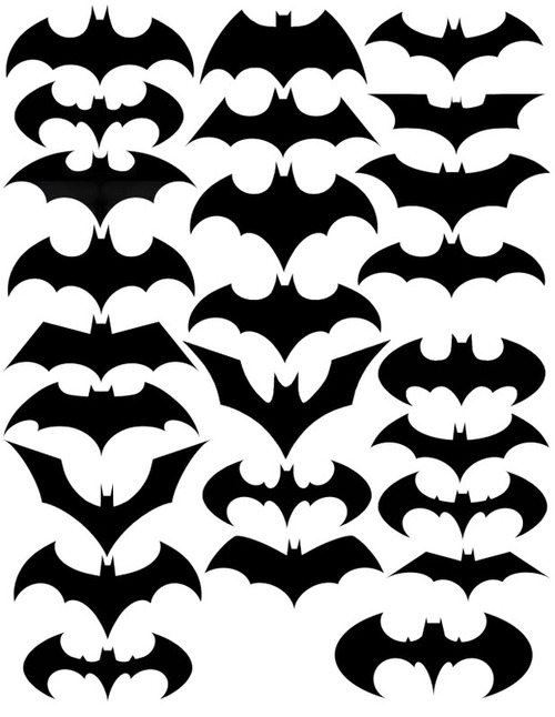
I’m not sure who made the static version above, but here is an equivalently amusing animated version below. The Dark Knight likes to keep things fresh. [CollegeHumor]
Evolution of Batman logos


I’m not sure who made the static version above, but here is an equivalently amusing animated version below. The Dark Knight likes to keep things fresh. [CollegeHumor]
I really like this. It’s very interesting how the icon has changed but remained completely identifiable. Thanks for putting the video together.
How did you do that and how long did it take?
Pingback: あの有名なバットマン・ロゴの進化がよくわかるイラストとムービー – DNA
Pingback: Mururoar | audiophilosophy, nerdism and crap » Blog Archive » links for 2010-10-16
Source of the image: http://designersgotoheaven.com/post/1242437663/changes-of-the-bat-symbol
Credit for the finding of the credit: http://news.ycombinator.com/item?id=1784184
Thanks. I must’ve gone through 20 tumblrs w/o finding where it came from.
Interesting that the animation is not using the same images (or not the same order?) as the static one…
Unfortunately it’s not available in my country (Germany).
Very timely update! Coincides with Batcave sighting, or at least insignia, in Okinawa, here’s link to the io9 article, “Batcave Discovered in Okinawa Using Google Maps:
http://io9.com/5665749/the-batcave-discovered-in-okinawa-using-google-maps
Pingback: Batman logo evolution | Tecnoetica
Pingback: Mutation of a comic book icon: The Batman logo through time → St. Eutychus
Pingback: Linkpeitsche » Dienstag