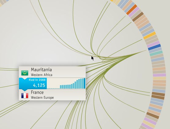
Thousands of people flee their country every year, and the travel patterns are by no means easy to understand. Christian Behrens, in a revamp of a class project, visualizes these refugee movements with three views. The first is a circular network diagram (above), where each slice represents a region or country. Lines represent flight and expulsions.
The second is a sankey diagram that lets you explore between origins and destinations. The fatter the flow, the more people involved.

These might look familiar to you if you’ve seen Moritz Stefaner’s eigenfactor work which visualizes relationships between academic work and journal articles. Like Stefaner, Behrens also made use of some of the functionality offered by the Flare framework, namely the Dependency Graph.
Finally, there is a map that lets you see things geographically. Click on a country, and connected countries are highlighted. Rollover the highlighted countries for the numbers.

All in all, very nice work that lets you explore a complex data set fairly deeply without overwhelming you with too much data at once.
[Niceone via Fast Company & @moritz_stefaner]
 Visualize This: The FlowingData Guide to Design, Visualization, and Statistics (2nd Edition)
Pingback: Reading While Eating for October 14: Bad Hair, Bad Beer, Bad Music - TIME NewsFeed
Pingback: Duomenų žurnalistika ir Tiesioginė prieiga
Pingback: The Path of Refugees « Hands Wide Open
Pingback: Duomenų žurnalistika ir Tiesioginė prieiga | Super subscriber