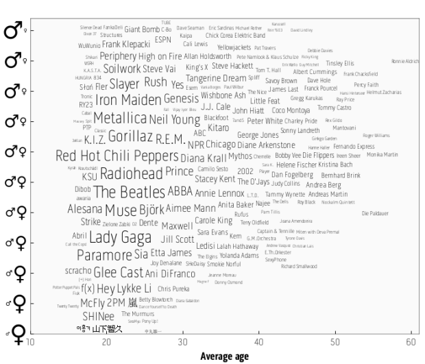
Last.fm intern Joachim Van Herwegen has a quick look at listening habits by age and gender:
The sizes of the artists’ names indicate how popular they are, while their position shows the gender mix and average age of their listeners. Based on the positions of the larger names, it’s already obvious which age category is most common amongst Last.fm users.
With age on the horizontal and gender breakdown on the vertical, artists on the bottom left are those popular among young girls. Top right are artists popular among older men. Red Hot Chili Peppers and Radiohead appear to hit the universal sweet spot.
I wonder how the graphs would vary across services. For example, I’ve been using Rdio for the past month, and nerd hipster music seems to be the hot theme around those parts. Hit up YouTube though, and everything is Bieberriffic. [Last.fm via Waxy]


 Visualize This: The FlowingData Guide to Design, Visualization, and Statistics (2nd Edition)

An interesting dataset and I like the visualisation. If I am reading it right, this means that the difference in tastes between genders is larger for younger users than for older ones or is that an artefact of the amount of available data at different ages (i.e. more data for younger users leads to stronger results)?
If it’s the former that’s an interesting pattern. I never thought about that but it seems sensible. If it’s the latter, that would be a problem with the visualisation.
Can someone explain to me how the gender breakdown works? If I’m reading it right, anything in the bottom right would be popular among people in their 50’s and 60’s, not young girls. What am I missing?
Oh, I meant bottom left for young girls. The horizontal axis is average age and the vertical is gender breakdown. So for example, Metallica listeners are about 70% male with an average age of early 20s.
Interesting view. I have the tastes of someone 25 years younger.
Stas – Obviously he meant lower *left* is young girls. Glee and Gaga and all that stuff my daughter likes.
Simon – Seems to me (and backed up by the comment Nathan quoted), there is much more data for younger users because last.fm has many more younger users.
What’s going on with the empty lower right corner and women over 30? Do women over 30 listen to less music? Register less on last.fm? Does their taste converge more with that of men? (Though older men still have more “male” music they listen to.) Are there fewer “women’s” bands that have grown up with that group? Hmmmm.
It says more about the last.fm population, I think. There aren’t a lot of women in their 50s to using the service.
I think the empty spaces indicate a potential problem with fixing a specific location across two variables rather than allowing that data to be displayed across a range. I suspect, for instance, that a lot of women in their 30’s like Radiohead, but because so many men in their 20’s like them, it has to occupy that position in the chart. If anything this shows that there seem to be no bands that are specific to women in their 30’s — everything that demographic likes is liked more by a different or more diverse demographic; due probably to the weighting of the overall sample to 20-somethings.
I am so happy Frank Klepacki is on there…
Pingback: Who listens what… – A ve'se Blog
I wonder what criteria is used to display artists. I find The Rolling Stones conspicuous by their absence. Likewise, although JJ Cale is a fine musician, Eric Clapton is much better known (even for doing JJ Cale songs) and likely receives much more airplay.
Pingback: BI DEVELOPMENTS » Blog Archive » Who’s Really Listening?
Pingback: Linkpeitsche » Po’alua
Pingback: SPK - Hombres y mujeres: ¿Nos gusta la misma música? (Reblog) @SPK_LA
If this is right, it also means that as we get older our listening preferences get “more male”?
Just bouncing around implications.
Pingback: Versailles is Turning Japanese & Chicago Shows Off Its Best Artists (I really think so) : Bad at Sports