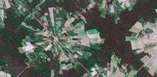
We saw math principles in nature. Now how about charts? Andy Woodruff does some sniffing around in Google Maps to find charts in rural landscapes. Above, you’ve got your polar area charts in Bolivia. It looks like an agricultural area. I have no idea how that kind of layout would be more efficient than squares though. Then again, I’m no farmer. Other chart types include pies, bars, and treemaps. Can you find anymore?
Landscape chartspotting
7 Comments
Second Edition
 Visualize This: The FlowingData Guide to Design, Visualization, and Statistics (2nd Edition)
 Visualize This: The FlowingData Guide to Design, Visualization, and Statistics (2nd Edition)
New tools, refined process.
The circular shape could be related to the system they use to water their fields.
Yeah, round fields in western US are because the irrigation system is fed through the center and a radius-length arm rotates around the center, irrigating the field. No need for these, thus orthogonal fields, in rainier climes.
i can get on board with that. i vaguely remember seeing something on discovery.
The pattern makes perfect sense if you need to walk to your fields. Each person owns a triangle, with the point at their home. They can farm as far into the woods as their labor (or their family’s labor) will take them.
Like Tyler my first thought was center-pivot irrigation. I grew up surrounded by such plots in Nebraska.
But the pie-slice shapes and long skinny plots to the southeast suggest manually intensive agriculture like Scott says.
Another possibility is swidden or shifting agriculture which works where growing seasons overlap (as in the tropics). As the soil is depleted, plots are abandoned to be reforested then burned or plowed under.
Egypt is also covered with these circular fields, also because of irrigation practical issues.
I think this shape is originated in the fact that all farms are built in a single village, in the center of the circular area. This has several defensive and social advantages.
I’m sure it has nothing to do with circular irrigation, the farms are surrounded by rainforest, and have thereby no shortage of water.