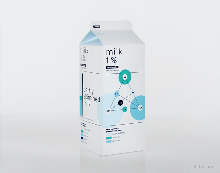
Nutrition facts labels are uniform across products, but let’s imagine for a second that you could do whatever you want, just as long they showed certain bits of information. FFunction takes a stab at redesigning the standard milk carton under this premise. No cows, no fields of green, and no dairies. Just nutritional facts and full transparency on what’s going into your body.
This wouldn’t work with a mass market, but hey, they’ve got my purchase. After all, data does a body good.
[Thanks, Audree]
 Visualize This: The FlowingData Guide to Design, Visualization, and Statistics (2nd Edition)
The concept is intriguing, but I hardly see this as the future of nutritional information. What we need is machine-readable nutritional facts and a device to read it, no need to use the packaging for that!
Pingback: Bookmarks for May 6th through May 10th | dekay.org
Pingback: Infographics and nutrition labels | Canadian Agri Food
This design obfuscates the data rather than illuminating it. The data itself is not difficult to understand, and none of the graphs would have any meaning if the printed numbers were omitted.
In fact, the graphs mislead: for example, it would appear from a visual inspection that roughly 95% of the milk is either carbohydrates, fat, or protein, when in fact those total only 9.6 grams per 100. (By the way, a serving of milk, in the United States at least, is 240 mL, or about 250 grams — so why are the quantities shown in the picture “per 100 grams”?) And imagine trying to compare the colored bubbles on the percent daily value graph between two different products with different-sized packaging and different color codes…
Pingback: Daily Links for May 9th through May 10th | Akkam's Razor
add transparent packaging and add even more data vis (how much you’ve got left), not necessarily environmentally friendly though (and would only work well for milk and other white foods and drinks)
Like the concept, don’t like the charts. These charts could easily confound your average milk user (i.e. me)..
Now add some values showing % antibiotics found in the milk compared to industry average, vitamin content and degradation with time in fridge, number of quality control issues…
Like all too much visualization lately, this is attractive and incomprehensible.
The triangular graphic is difficult to decode. Two side by side bar charts, while “boring”, would show the information clearly.
There’s no indication what the circular graphic is supposed to show.
The circular graphic indicates nutrient balance and it’s completeness score between 0 and 100.
It offers a visual representation of a food’s nutritional strengths and weaknesses, with each spoke representing a different nutrient. A completeness score between 0 and 100 is a relative indication of how complete the food is with respect to these nutrients.
–
The triangular diagram indicates the caloric ratio, percent daily value and total calories. The location of the black circle shows you what percentage of the calories in a food come from carbohydrates, fats or proteins. Foods low in fat, for example, will cluster along the bottom edge of the pyramid, ranging from foods that are high in carbohydrates (at the left edge) to foods that are high in protein (at the right edge).
The number in the black circle is the total calories while the other numbers are amounts of calories per selected serving. And then % daily value.
BTW this was a quick, fun week-end exercise, I was not trying to change the future of nutritional information or packaging. Sorry!
Pingback: We Really Need Better Packaging For The Stuff We Eat
Pingback: ミルクにもインフォグラフィック » 経済学101
Gee, people are a bit harsh. Yes the info is not necessarily what is needed, but I like the concept. It will actually make me read it instead of just ignoring the usual boring writing.
Pingback: Beautiful data | Décoller