Want more? Catch other Data Underloads.
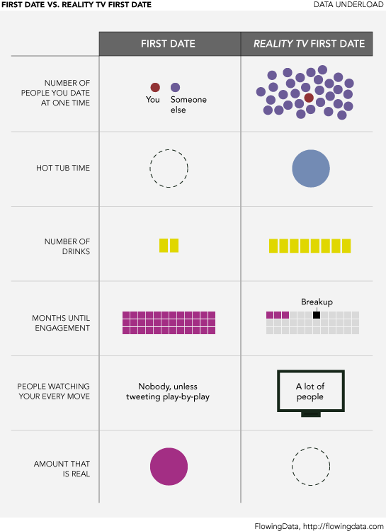
Data Underload #19: First Date vs. Reality TV First Date
7 Comments
Second Edition
 Visualize This: The FlowingData Guide to Design, Visualization, and Statistics (2nd Edition)
 Visualize This: The FlowingData Guide to Design, Visualization, and Statistics (2nd Edition)
New tools, refined process.
Pingback: Infographic of the Day: First Date vs. Reality TV First Date. No… | primo
I find this incredibly difficult to decipher. The empty and dotted circles.. what?
the empty circles mean, well, empty i.e. zero.
Great work. Nice visualisation, and so true!
I really like how you use simple images to tell a story. Thanks for sharing. Planning to reference (if that is OK) as a good example of visual story telling. Best. P.
yeah, of course it’s okay. thanks, peter.
Pingback: Reality Dating « Katelyn M. Thompson's Blog