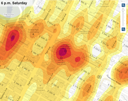
Matthew Bloch, Ford Fessenden, and Shan Carter continue the New York Times geographic sexiness with their recent interactive, mapping taxi flow across Manhattan over time. The scroll up top lets you move through times of the week, or just press play and watch it go. You can also roll over blocks to see rides per hour.
To the right are some pre-selected locations that you can look at. The best one has gotta be Lexington Avenue at 60th Street a.k.a. Bloomingdale’s.

About the Data

The data that makes this possible comes from a partnership between Sense Networks and New York City’s Taxi & Limousine Commission. The Taxi & Limousine Commission provided millions of GPS data points, and Sense Networks processed it, and made use of it.
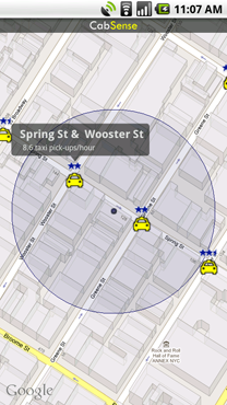
The end result: CabSense, a free mobile app available on the iPhone and Android phones that tells you the best block to wait for a cab, based on time and your location.
That’s right. No more waiting around in random areas, wondering where all the cabs are. There’s also an online version, but if you’re going to do that, you might as well use the NYT interactive.
In any case, I’m sure there are plenty of New Yorkers who will find this useful. Has anyone tried it yet?

 Visualize This: The FlowingData Guide to Design, Visualization, and Statistics (2nd Edition)

Pingback: 60th St. Bloomingdales Is Objectively The Best Place In Manhattan to Catch a Cab [Maps] | Trendy Gossip
I posted this precise text on Facebook and then thought more people might see it here. I don’t want to be a jerk – I want to understand if I’m missing something…
Okay, I don’t get this. Please explain. The data itself – very cool. Surely we can learn a great deal from it. I can’t be smarter than the NYT and FlowingData, but I think I disagree with just about everything the article in the NYT said.
If nothing else, shouldn’t you have said awesome work by Blake Shaw, Sense Networks, and the Taxi and Limo Commission? I may just not understand how much work Fessenden, Bloch and Carter did, but it looks like 70 or so plots of data provided to them, and Flash. I love looking at the map and don’t want to be just a curmudgeon about this.
I myself have caught taxis at Bloomingdale’s (though I live in DC). But wouldn’t this whole study be better titled “Best place for a cabbie to find a customer?” or “Best Place to observe people too rich to ride the subway or walk, and too poor to have a chauffeur”? To illustrate with an extreme, suppose there is a huge colony of cab drivers idling in their cars, hour after hour, in the middle of the meadow in Central Park. Hundreds of them, hoping someone will come by. In this scenario, this would obviously be the best place in Manhattan to hail a cab – there would never be a wait. But cabs never go there – it would be a stupid place to wait.
The data can’t reflect waiting times. That would be huge, wouldn’t it? The places and times with the longest waiting times would be an even better data point for cab drivers looking for a fare. The best place is the place where there are always cabs, but that just reflects the imperfection of the market; both cabs and riders want there to be a balance of riders and cabs.
In DC we famously have an issue with race and neighborhoods. Be white, dress differently, or just stand on the side of the street headed into downtown, instead of toward the hood, and you get a different waiting time (or maybe it goes to infinite waiting time). I would guess the same is true in NYC.
They mention dealing with construction and other variables, but surely weather is a huge, huge factor, creating a glut or a shortage of taxis.
I realize there might be some virtuous circle stuff going on here. In DC, we have “slug lines”, where private commuters pick up strangers in order to use the reserved High Occupancy Vehicle lanes. Almost by magic the market has created these popular pickup points. Clearly, as riders learn their way around NYC, they might naturally walk to places where they know there is a formal or informal taxi stand, and it’s a self-fulfilling prediction. That works well for both parties.
Again – the data is very exciting. It’s easy to foresee a great day in the future where five-square or something gets taxis to movie theaters just as Avatar III gets out, and wakes up more drivers when it’s raining. Your Blackberry Tablet Watch lets you know that you can order another drink because the right “buyers market” for taxis won’t emerge for ten more minutes.
The article even says “And make sure you are in the right neighborhood: taxi rides are 25 times as likely to start in the West Village as in Washington Heights.” WTF? By definition you are never in the “right” neighborhood when you want a cab. Are we supposed to take the subway to wherever the taxis are? And taxi rides are 1,000,000 more likely to begin at Bloomies than the deck of the Intrepid – so what?
it’s definitely not a cure-all. i mean there are obviously going to be times when you can’t plan to be in an area where there are a lot of cabs, but i imagine this being really useful when a move few blocks north could mean a shorter wait.
now the whole correlation/causation thing is debatable. you can at least be sure you’re going to be in a place where there’s more people. i think cabs are usually going to be in areas where there are more people – not the other way around i.e. more people in an area b/c of more cabs.
You raise some important points on how the data was collected. It’s obviously cool to look at, but I also think there is a ‘chicken or the egg’ problem lurking underneath all the data.
Pingback: jardenberg kommenterar – 5 Apr, 2010 | jardenberg unedited
Pingback: Tracking City Behavior With Taxi Pickup Data - PSFK
Pingback: Infographic of the Day: Tracking Taxis Across Manhattan | Web Design Cool
Gary —
I think that the way to look at this heat chart is to basically look at it as a forecasting model. They’ve plotted the historical data and, if history repeats itself, the application tells you where the most cabs flow.
As you have pointed out, this is historical, observed data. There may well be a large “censoring” effect (cabs going where there most likely to get longer trips, more money, be safer, etc.). Also, this chart doesn’t balance supply and demand. You can have a lot of cab trips and still have a long queue for taxis.
It is certainly interesting to talk about, though!
Pingback: Infographic of the Day: Tracking Taxis Across Manhattan | Stocks!
Pingback: Grande giornalismo visuale | LSDI
I agree with Tony that the data is somewhat misleading because of the supply and demand factor. For example, outside of Penn Station the chart says that there are 55 rides per hour at 3 pm on a Sunday. Of course, there are always at least 3 times that many people looking for a ride at that time and location. It is useful data, though!
Pingback: Numbers. at Pekes en Ertjes