An Easy Way to Make a Treemap
If your data is a hierarchy, a treemap is a good way to show all the values at once and keep the structure in the visual. This is a quick way to make a treemap in R.
Back in 1990, Ben Shneiderman, of the University of Maryland, wanted to visualize what was going on in his always-full hard drive. He wanted to know what was taking up so much space. Given the hierarchical structure of directories and files, he first tried a tree diagram. It got too big too fast to be useful though. Too many nodes. Too many branches.
The treemap was his solution. It’s an area-based visualization where the size of each rectangle represents a metric since made popular by Martin Wattenberg’s Map of the Market and Marcos Weskamp’s newsmap.
Here’s a really easy way to make your own treemap in just a couple lines of code. We’re looking to make something like the above.
Step 0. Download R
Like before, we’re going to use R, so you’ll want to get it before going any further. Download it for Windows, Mac, or Linux. Don’t let the out-dated site full you. You can get a lot done with the free software.
Step 1. Load the Data
We’ll use data covering a hundred popular posts on FlowingData. Here it is in CSV format. You don’t have to download it though. We’ll just load it directly into R. The main thing to take note of is what is there. There’s post id, number of views, number of comments, and category.
Okay, let’s load it into R using read.csv():
data <- read.csv("http://datasets.flowingdata.com/post-data.txt")
Loading data in CSV format into R.
Easy enough. We just used the read.csv() function to load data from a URL. If your data is on your computer, you could also do something like data <- read.csv("post-data.txt"). Just make sure the data file is in your current working directory, which you can change via the “Miscellaneous” menu.
Step 2. Load the Portfolio package
Only a few more lines of code, and you’ve got a treemap. It’s so easy, because we’re going to use the portfolio library in R. First, you have to install it. You can either install the library via the “Package Installer” or you can do it through the command line. Let’s do the latter. Type this in the console to install portfolio:
install.packages("portfolio")
Once installed, load it into R:
library(portfolio)
Step 3. Make the Treemap
It’s time to make the treemap with map.market(). Type this in the console:
map.market(id=data$id, area=data$views, group=data$category, color=data$comments, main="FlowingData Map")
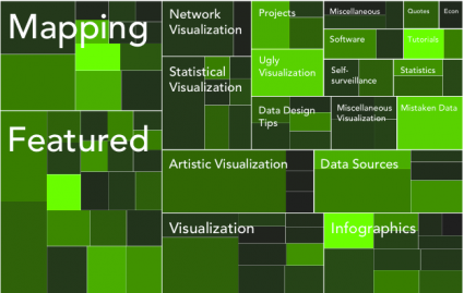
Tada. You should get something like this:
The default treemap uses a red-green color scale.
To sum up, we did this with four lines of code:
data <- read.csv("http://datasets.flowingdata.com/post-data.txt")

install.packages("portfolio")

library(portfolio)

map.market(id=data$id, area=data$views, group=data$category, color=data$comments, main="FlowingData Map")
Step 4. Customize
Now maybe you want to modify something like color. The cool thing about R is that you can see the code for all the functions, edit it, and then use your customized version. If the green and red scheme isn’t for you or you don’t care about the positive/negative cutoff, then you can change the code to do that. I won’t go into detail, but if you type map.market in the console, you’ll see the function. You can change color or cutoff around lines 36-46.
For example, you can do a black and white color scheme:
You don’t have to stick to the default color scale though.
I was alright with the green for this, so I saved it as a PDF and then loaded it into Illustrator as usual. I numbed the green some, cleaned up the labels with a new font and layout, and updated the legend.
Touched up version of treemap with black-green color scale.
And there you go – a treemap with just a few lines of code in our all-trusty R. Rinse and repeat with your own data.
For more examples, guidance, and all-around data goodness like this, order Visualize This, the FlowingData book on visualization, design, and statistics.
Made possible by FlowingData members.
Become a member to support an independent site and learn to make great charts.
About the Author
Nathan Yau is a statistician who works primarily with visualization. He earned his PhD in statistics from UCLA, is the author of two best-selling books — Data Points and Visualize This — and runs FlowingData. Introvert. Likes food. Likes beer.

then again, if R is too scaRy, there’s always http://www.many-eyes.com.
if customization or data privacy isn’t an issue, always go with many eyes :)
What about Data Applied? Their free plan keeps visualizations private (or you can embed in HTML to share). I find their stuff slightly better than Many Eyes, except for text mining.
Thanks for another simple tutorial, Nathan. In your example, I find it interesting that the number of views doesn’t necessarily correlate with the number of comments. What’s even more striking is how topics like Ugly Visualization and Mistaken Data get more comments than some of the arguably more interesting topics. I guess people love to critcise?
Hrishi,
Your comment that people love to criticize is totally, completely, absolutely wrong in so many ways. ;)
people looove to band together over something that is clearly wrong. it should be noted also though that mistaken data and ugly viz only have one post each in the top 100.
another thing is like when stuff gets hot on digg or stumbleupon. they might bring a lot of views, but not a whole lot of discussion.
Thanks very much for this helpful tutorial. You’ve finally convinced me to check out R.
Though I love http://www.many-eyes.com it’s frustrating not to have total control of your treemap.
Pingback: Make a Treemap with R! « Visual Security
I could recommend WinDirStat
Its Free.
Its easy to use.
It really helps on finding what is filling up on your harddrive.
I have freed up alot of gb’s with this app.
Try it, You wont regret,
Pingback: Tech Thursday – Flex for all, win CSS books, calculating earth and whale anatomy | Techno Portal
If he needs to know what is using up most of the space on his hard drive…
http://www.jgoodies.com/freeware/jdiskreport/
I was just working on using mosaicplot() this morning to hack together a treemap, glad I checked FlowingData before getting too deep into it!
Thanks for another great tutorial, though it is a little eerie that you posted this the exact day I needed it…. :)
i’m waaaatttccching you.
Pingback: Bookmarks for February 11th from 21:11 to 22:10 | jansroka.com
An Excel add-in to create treemaps also exists:
http://research.microsoft.com/en-us/downloads/3f3ed95e-26d8-4616-a06c-b609df29756f/default.aspx
This is great! I love simple tutorials that lead to tangible results, and this is one of the best.
I might have liked a short explanation of how to change the colors, but that would have definitely been icing–the cake was already there.
Again, good job.
I downloaded & started learning R after the NBA heatmap tutorial. I had no idea there were straight-forward, powerful, free tools available. So, thanks for the introduction!
With regard to the treemap — I’m guessing putting things like mouse-over titles onto the squares can’t be done in R (or is easier to do elsewhere). Is there a good, inexpensive, OS X -compatible tool for doing that?
For those that find `R’ a bit daunting, a wonderful, aesthetically pleasing Treemap interface can be found here:
http://macrofocus.com/public/products/treemap/download/
I think it’s one of the better Treemap softwares on the market.
Many thanks for the kind words! We will do our best to make Macrofocus TreeMap even better ;-)
Nice post! More of this and pointers to more of this :)
Pingback: Daily Digest for February 11th
Great tutorial, Nathan.
Have you seen any implementation in which it can show more than 2 levels?
Note: neither the Excel Add-In nor the Macrofocus product allow you to modify the graphic in another editor; it only exports it as a “picture”. So if you don’t like exactly what you see … tough. Graphics in R can be copied as a metafile, making it a snap to make changes in Illustrator or even PowerPoint.
Dear Kevin,
There is a function in Macrofocus TreeMap to export into PowerPoint native format (and therefore allow modifications). In is in beta right now, but we would be happy to make it available to you…
Great post!
Any ideas for how to get CSV info on your file structure? We use an AFS implementation, and so if there’s a nice way to query all of the substructure of a given directory for size information and dump that into a CSV, I’d be set, but I’m not sure how to go about actually collecting the data. I can get at the directory structure as both a mounted drive in Windows or Mac, or I can get at it via a Unix box over SSH. Thanks!
Thanks, great tuto! Simple and efficient. I guess the font used for your last result is Adobe Avenir, I managed to change colours, I will manage to move the gradient bar below, but… How do you make the text go on a new line? for long sentences, it goes off the square too easily… Cheers
@Stephane – Avenir, correct. I did the text stuff in Illustrator, but if you wanted to do that in R, you’d have find the word length, find the width of the rectangle it is a label for, and then split the word accordingly, by space or hyphen.
Cool example; I can’t wait to try it.
It is disingenuous to say that this is only “four lines of code”. This is correct for calling out to a predefined function, but it misrepresents the amount of time required to develop said functionality in R.
Anything can be run in 4 lines with the appropriate subroutine call.
Still, that’s not meant to take away from what is a neat function.
@Michael – absolutely. there’s a lot of stuff going on under the hood, but for the purpose of this tutorial and for the group of people who will most likely use this tutorial, it’s four lines of code :).
of course, i encourage people to look under the hood once they’re comfortable.
Pingback: links for 2010-02-14 | Imola Blog
Pingback: Things I learned this week – #7 | dougbelshaw.com/blog
I’m a complete R newbie, but have heard about it before so thought I’d follow your tutorial to see what it’s about. I followed your steps, but when I submitted the last command, the map.market() function, I received the following error:
Error in data$id : object of type ‘closure’ is not subsettable
Any idea what that’s about?
Thanks!
@angie – it looks like the data wasn’t loaded. did you execute that first line?
data <- read.csv("http://datasets.flowingdata.com/post-data.txt")
@Nathan, I did indeed, and it even echoed back the contents of the file on the screen. I just tried again, followed immediately by another try of the map.market function and I still get the same message.
Try restarting R, and name the variable ‘postdata’ instead:
postdata <- read.csv(“http://datasets.flowingdata.com/post-data.txtâ€) and replace 'data' in map.market() with 'postdata' there's a data() function, and R is getting mixed up, i think.
@Nathan, I restarted R and it works. Thanks so much! This looks like it’ll be tons of fun to play with, and very useful, too.
Pingback: An Easy Way to Make a Treemap | nothing to see here
Sorry to spoil the party but with Chrome the graphics I see are all the same: a picture of an old grinning man. I’ve seen what’s meant to be there using IE.
is it still like that in chrome?
OK now.
Great!!!!!
Hi there,
many many thanks for this wonderful post! It inspired me a lot how to visualize a biodiversity dataset!
best
Jens
Pingback: Weekly Roundup: Design Related Links #7 « Discovery Session… by Gerard Dolan
I’ve noticed that R crashes when calling map.market on large data sets. For example, I took a CSV file with about 52,000 items and tried to call map.market on it. On a machine with 4 gigs of RAM, R began using more and more RAM until it got to about 1.5 gigs. Then it crashed.
The dataset I was using included individual orders. I’m guessing I need to aggregate the data in some way, perhaps using tiers for things like the amount of the order ($0.01-$5.00, $5.01-$10.00, etc). But since a treemap involves multiple dimensions, I’m guessing I would need to aggregate the data in multiple dimensions.
I have an idea of how to do this in SQL with subqueries and group by statements. Can someone give me an idea of how to do this in R with a dataset that starts look looking like the following csv file?
id,report_type,category,market,product_id,created_on,ordered_qty,amount,shipping_amount,shipping_type
42538359,NEW,Dvds,SomeMarket,Z000BT99CK,2/7/2010 15:59,1,23.95,2.98,Standard
Also, do you know the upper limit on how many rows map.market is capable of handling?
I know I’m asking a lot here as a brand spankin’ new user to R, so perhaps even pointing me in the right direction where I could find more info would be helpful.
Thanks.
R is notorious for inefficiency when it comes to big data, at least within a regular client. They’ve been doing a lot of work with R and distributed computing, I think…
anyways, back to your problem. i’m not completely sure what you’re after, but you can do subsetting in R with something like this:
financedata <- financedata[financedata$amount < 5,] This is assuming you did a read.csv() stored into a dataframe named 'financedata'. hth.
Pingback: What Are You Blogging? :: A slow day at work….
Pingback: Blog post popularity as a treemap [infographic] | dougbelshaw.com/blog
Pingback: [R] Minu esimesed sammud R-s « Timgluz'i küberruumi projektsioon
Pingback: Twitter Weekly Updates 2010-02-23
Wow, really easy! Until now I could only dream about visualizing such maps. As a 5-year-on-and-off R user, this this comes as a nice surprise… It also seems worthy of an entry in R graph Gallery ++++
http://addictedtor.free.fr/graphiques/allgraph.php?sort=package